Color Wheel Workshop Follow-up Two
Dec 14. Objective: evaluate the color wheel's built-in mechanism to select monochromatic, complementary and analogous schemes as well as split complementary, triad, and tetrad harmonic schemes.
Please come to the session with a couple of examples of your paintings for harmonious color analysis.
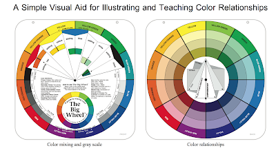
For the sake of this evaluation I will use the back of the Big Color Wheel since it does not include the text overlays:

One note is that using neutralized complements might make for a more realistic landscape. So for example, rather than choose a high chroma Red/Green for the majority of a landscape, I would consider the neutralized versions: tints, tones and shades. to add a spark to the painting, I would add spots of the high chroma versions as well.
Example 1: Buckman Road by Doug Higgins. Mountain range, desert landscape. I will use Higgins' example here, described also in the first Color Harmony post in November, Color Harmony
Could we have determined this scheme using the color wheel? Higgins considers the middle distance colors to be purple/purple blue, or with our terms, Violet/blue-violet. And I see that the colors opposite on the standard triadic color wheel are indeed yellow/yellow-orange. Higgins does say that he used a higher chroma yellow to bring the grasses forward. The Violet/Blue-Violet also have high chroma (for blue). However, there are many touches in these yellow/violet areas of tints, tones and shades that can actually be seen on the color wheel.
The remainder of the painting has colors analogous to the yellow/violet complements. Red-violet is part of the yellow, blue-violet, red-violet split complementaries. I see a muted red-violet in the distant mountains, even tending toward the red tone. (mixture with a grey) The red-tone is opposite the green shades and tones, which are also part of this painting.
To add to the harmony of this painting, we should see the color in the sky in the landscape terrain. The middle-ground 'green' is muted, drawing it into the distance. It seems to be muted with the sky color. We also see some traces of this in the near foreground, or perhaps these are pure grays, undoubtedly mixed from the colors on the palette.

Digression: to clarify, the colors on Higgins' palette are cadmium yellow light, yellow ochre, cadmium red light, alizarin crimson, ultramarine blue, phthalo blue and viridian with titanium (permalba) white primarily. He also uses supplementary colors as needed: cobalt violet and phthalo blue among others as indicated. His palette has grown since I studied with him. Note that since Doug does not have black on his palette, his dark will be a mix of colors: an opaque dark would be the cad red lite plus ultramarine blue with some yellow, while his transparent dark would be viridian plus alizarin. Grays would be formed by adding whites and perhaps touches of the red and yellow for a warmer gray.
Example 2. Late August Colorado by Doug Higgins. Blue/Orange harmony.
"In the following example, the basically Blue, Yellow/Red harmony of the mountain is somewhat muted compared to the foreground colors in order to achieve distance." Yellow/Red is the Orange.

Example page from the "Munsell Book of Colors":

The highest chroma for this (mid hue) purple-blue is of lower value than the highest chroma for this (mid hue) yellow, its complement in the Munsell system.
Please come to the session with a couple of examples of your paintings for harmonious color analysis.
Color Harmonies:
We will discuss various harmonies beginning with complementary harmonies. In particular I will focus on the landscape. For this reason, I will include for analysis, harmonies of landscape colors.- Complementary Harmonies 1: Violet/Yellow, Red/Green, Blue/Orange
- Complementary
- Harmonies 2. Blue-Violet/Yellow-Orange, Red-Violet/Yellow-Green, Red-Orange/Blue-Green
For the sake of this evaluation I will use the back of the Big Color Wheel since it does not include the text overlays:

The Pocket Guide to Mixing Color might be useful. You were given this in the original packet. Let's look at it as well.
One note is that using neutralized complements might make for a more realistic landscape. So for example, rather than choose a high chroma Red/Green for the majority of a landscape, I would consider the neutralized versions: tints, tones and shades. to add a spark to the painting, I would add spots of the high chroma versions as well.
Example 1: Buckman Road by Doug Higgins. Mountain range, desert landscape. I will use Higgins' example here, described also in the first Color Harmony post in November, Color Harmony
This is one of my favorites, painted very near my home in Santa Fe:
 |
| "Old Buckman Road" OIl 24" x 30" by Doug Higgins |
In the Buckman Road example, "The middle distance cliff is the center of interest and its shadow is mostly Purple/Purple Blue. I wanted Yellow in the near distance for two reasons, as a complement to the Purple and to bring the grasses forward. The Yellow was not as pronounced as I painted it and the complements are detached. When not detached, complements may injure each other where they join. .... This painting is a Yellow/Purple harmony. "
Could we have determined this scheme using the color wheel? Higgins considers the middle distance colors to be purple/purple blue, or with our terms, Violet/blue-violet. And I see that the colors opposite on the standard triadic color wheel are indeed yellow/yellow-orange. Higgins does say that he used a higher chroma yellow to bring the grasses forward. The Violet/Blue-Violet also have high chroma (for blue). However, there are many touches in these yellow/violet areas of tints, tones and shades that can actually be seen on the color wheel.
The remainder of the painting has colors analogous to the yellow/violet complements. Red-violet is part of the yellow, blue-violet, red-violet split complementaries. I see a muted red-violet in the distant mountains, even tending toward the red tone. (mixture with a grey) The red-tone is opposite the green shades and tones, which are also part of this painting.
To add to the harmony of this painting, we should see the color in the sky in the landscape terrain. The middle-ground 'green' is muted, drawing it into the distance. It seems to be muted with the sky color. We also see some traces of this in the near foreground, or perhaps these are pure grays, undoubtedly mixed from the colors on the palette.

Digression: to clarify, the colors on Higgins' palette are cadmium yellow light, yellow ochre, cadmium red light, alizarin crimson, ultramarine blue, phthalo blue and viridian with titanium (permalba) white primarily. He also uses supplementary colors as needed: cobalt violet and phthalo blue among others as indicated. His palette has grown since I studied with him. Note that since Doug does not have black on his palette, his dark will be a mix of colors: an opaque dark would be the cad red lite plus ultramarine blue with some yellow, while his transparent dark would be viridian plus alizarin. Grays would be formed by adding whites and perhaps touches of the red and yellow for a warmer gray.
Example 2. Late August Colorado by Doug Higgins. Blue/Orange harmony.
"In the following example, the basically Blue, Yellow/Red harmony of the mountain is somewhat muted compared to the foreground colors in order to achieve distance." Yellow/Red is the Orange.
 |
| "Late August, Colorado", oil, 20"x24". by Doug Higgins |
Center the harmony side of the color wheel focused exactly between blue and blue-violet and look at the tones - a fairly good approximation to the colors used in this landscape.
Additional examples: we will discuss these while looking at the given wheel Then i would like to see if my personal wheel will also work. For now, though, I will keep information on my personal wheel in the Water Soluble posts. My determination: the personal color wheel I made does not have enough variation on it to be helpful.
So, look at each of these paintings to see if the standard color wheel can be of help:


So, look at each of these paintings to see if the standard color wheel can be of help:


Personal Color Wheel

Possible Problem 1. Blue/Violet selection. As mentioned above, I feel that the personal color wheel I made will not work for me. Perhaps I wasn't careful enough to select blues and violets that differ enough on the color wheel. As I have noted in the past, cobalt blue and ultramarine blue seem not to provide enough variation in the mixes at least for the water soluble oils. Perhaps I will do a separate cobalt blue/ultramarine blue analysis. So perhaps the wheel doesn't have quite the right combinations.
Possible Problem 2. Complexity. Perhaps this blank color wheel is too complex. It adds tints, tones and shades that are not in the standard wheel, doubling in number. And it's complex to look at.
Possible Problem 3. Carelessness. The wheel is so time-consuming that it's difficult to keep the mixes logical and organized.
Alternative Charts or wheels
Digression: Perhaps a color wheel of only six hues would suffice, similar to our original home exercises. Perhaps they could be enhanced with a little effort. I might try to do this on a given blank chart, leaving the tertiaries blank for example and using just one tint, tone and shade for each hue. Perhaps the shade could be a mix of the basic hue and its complement.
Charts requires putting down on the paper (in two dimensions) color mixes and variations that are helpful, clear and simple. This usually means a chart comparing two colors; for example, hue versus hue, or mixes of each color with every other color on your palette. We also want to see tints and tones though. So what is the best ways to add these to your charts.?
Review from an earlier post: helpful charts might be similar to the following. The color value chart has values from light to dark; with whites mixed in with the 6 colors used for lighter values and 'black' mixed in for the darker values. This might be a useful chart based on your choice of six basic hues. The construction of the complementary chart would be valuable. Try different pairs of complements, varying the interior color by mixing more and more of the complement into the original color. The ideal would be to achieve a perfectly neutral gray in the middle.
 |
| Color Value Chart |
 |
| Color Complementary Chart |
Personal Magic Palette
And of course, creating your own person magic palette might be useful. See large chart on the wall. The weakness is that tints and tones are not part of the palette chart, but in fact since complements will be mixed wight he original color, we do have a lot of results.
Tip 1: To avoid the duplication of mixes, the left hand axis is used as the dominating color in the mix.
Tip 2. Add a little white to the darks in the mixes.
See the video on how to mix the magic palette: Magic Palette uTube. To buy the personal magic palette, dick blick is having a good sale ($8.09!) usually almost $12. dick blick magic palette.

I wonder how long it would take to create this magic palette with my own tube paints.
From a previous post:
The magic palette provides mixtures of many popular colors with each other (acrylics and oils but watercolor pigments could be compared; see list below). Note that the mixtures vary on the horizontal and vertical axes, with the vertical axis providing the dominant color-hue. In addition a small amount of white is added to each color (again varying from color to color and dominant axis to the other) to enhance the color. See explicit instructions on how the palette is created in this link:
Personal Mixing Guide: 18 Artist’s Paint Colours and Pigments Produces 324 mixed hues
• Cadmium Yellow Light (Py35)
• Cadmium Yellow Medium (Py37)
• Cadmium Orange (Po20)
• Cadmium Red Medium (Pr108)
• Quinacridone Red (Pv19)
Alizarin Crimson (Pr83)
• Magenta (Pr122)
• Dioxazine Purple (Pv23)
• Ultramarine Blue (Pb29)
• Phthalo Blue (Pb15:1)
• Cerulean Blue (Pb35)
• Phthalo Green (Pb36)
• Sap Green (Pb15,Py83)
• Perm. Green Light (Py74)
• Burnt Sienna (Pbr7)
• Raw Umber (Pbr7)
• Payne’s Grey (Pb29,Pbk11,Py42)
• Ivory Black (Pbk9)
• Titanium White (Pw6,Pw4)
The Guide works on a simple grid system. Dominant colours are shown in the left margin and Mixing colours are shown at the bottom. Where the two colours intersect on the grid is the Target colour you achieve by mixing both colours.
Each Target colour mixture contains only one Dominant and one Mixing colour, plus Titanium White.
Step 1Select the colour you want to mix from the Magic Palette grid. This is your Target colour.
Step 2From your Target colour follow the row to the left margin where you will find the Dominant colour. Now, follow the column down to the bottom margin, where you will find the Mixing colour. Using your palette knife, place a dab of each on your palette.
Step 3The 18 original paint colours are never used straight from the tube. Lighten the Dominant colour and the Mixing colour separately with Titanium White to match the Dominant and Mixing colours illustrated on the guide. Add the white very slowly. Yellows, oranges and reds require no more than 5% Titanium White. Darker colours will usually require slightly more white.
Step 4Begin mixing the Target colour you originally chose. Using a palette knife start with the Dominant colour and slowly add in the Mixing colour in very small increments. Continue adding the Mixing colour until you match the Target colour.
The Magic Palette also has a Color Matching Guide, very portable. It won't have the mixes but it ors have tints and shades for every color on the Magic Palette. I am going to see if I can find every mix on the color wheel on the guide (and/or the magic palette itself) and vice versa.
Zorn's Chart:
I have restudied this chart and like what it has: varying tints for each of the main colors and mixes as well as a variety of greys from the main colors. This chart is based on a primary triad of red, yellow and black:

Note the nice tints at the bottom row. I did many similar charts using a basic triad, with whites added as is done here. I like the addition of the treys on the right. I am tempted to try to create yet another such chart for my primary colors: cad yellow light, cad red light and ultramarine blue. Use scotch tape (especially the narrow type) to mark off the squares for a neat look.
Munsell:
The Munsell color space is three dimensional, hue, value and chroma. To try to do a chart using all three variables is difficult. Instead we can do two variable charts. For example, if you look at Munsell charts, they are usually categorized by specific hue. So for example, the hue chart for Red has all value and chroma variations for red; we are varying the value and the chroma:Example page from the "Munsell Book of Colors":

The highest chroma for this (mid hue) purple-blue is of lower value than the highest chroma for this (mid hue) yellow, its complement in the Munsell system.
This can be helpful, but his pages do not have mixes across the color wheel.


Analogous Color Wheel:
Harold Reed's Analogous Color Wheel is based on the Munsell space using 5 principle hues and secondaries mixed from them. Using a total of ten mixes versus twelve might simplify the process sufficiently. Let's include the wheel here again (note: part of the wheel is covered when using it to determine the complements, analogous colors and discords as well as neutrals:
We need to analyze this further.

The Munsell Color Wheel from Kessler's Book:
This is the interior wheel of the store-bought wheel for Reed. Note that we can construct our own such wheel. The overlay is similar to the rectangular white sheet above that covers up part of the wheel below. Note that I find these resulting colors to be too dark for me to be helpful, but perhaps we can vary them more.