Grammar of Color by Miss Helen Dryden for Vogue from www.munsell.com
Interesting example of a reference to color harmony for Vogue in 1921: http://munsell.com/color-blog/grammar-of-color-helen-dryden-vogue-proofs/
Part 12 is given here, but at the bottom of this article there are links to previous parts of A Grammar of Color.
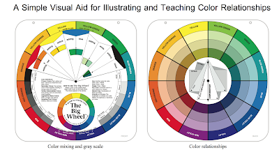
This example describes an interesting take on color harmony based on an assumption that all the colors in a plate should become a neutral gray when mixed (rather than a mud brown, for example). The use of a circle with the proportion of the colors used is also interesting.
Also copied here:
A Grammar of Color – Part 12: Two Proofs of a Design by Miss Helen Dryden for Vogue

We have been posting excerpts from the 1921 book, “A Grammar of Color”, by T.M. Cleland with an introduction by Albert Munsell. The first half of the book focused on explaining how the Munsell Color System works, and suggested ways it can be used. We now start the second half of the book, which consists of some color illustration examples followed by a catalogue of color papers by the Strathmore Paper Company.
In the original book, there is an almost blank page with only a brief description of the two pages to come. The following two pages each consist of a plate with an illustration by Helen Dryden for Vogue; the first plate demonstrates unbalanced color, and the second plate is corrected with an example of balanced color.
Helen Dryden was an American artist who was a fashion illustrator for Vogue magazine for 13 years during the time A Grammar of Color was authored. Rudolph Ruzicka was a distinguished wood engraver, etcher, illustrator, typeface designer, and book designer.
TWO PROOFS OF A DESIGN BY MISS HELEN DRYDEN for VOGUE
showing unbalanced and balanced color
PLATES ENGRAVED BY RUDOLPH RUZICKA
PLATES ENGRAVED BY RUDOLPH RUZICKA
UNBALANCED COLOR

Unbalanced Color
The colors in this proof are poorly related and do not balance in neutral gray. In the first circle these colors are shown in approximately the same proportions of area that they occupy in the picture. If this circle were rapidly revolved, the resulting mixture would be as shown in the solid circle.

BALANCED COLOR

Balanced Color
In this proof, made from the same plates as the one on the opposite page, the colors are correctly related. The approximate proportion of area of each color to the whole is shown in the first circle. The neutral gray, which would result from an admixture of these colors in these same proportions, is shown in the solid circle.

In coming blog posts, we will provide sections of the pages with the descriptions of the color sheets. Here’s where to look for previous sections of “A Grammar of Color”: (Click on the part to go to the link)
- Part 1: Home Page
- Part 2: Preface, by the Strathmore Paper Company
- Part 3: Introduction to the Munsell Color System – The Color Sphere
- Part 4: Introduction to the Munsell Color System – Balance of Color
- Part 5: Introduction to the Munsell Color System – Unbalance of Color
- Part 6: A Practical Description of the Munsell Color System with Suggestions for Its Use – Section One: Hue, Value, Chroma
- Part 7: A Practical Description of the Munsell Color System with Suggestions for its Use: Color Chroma Scale
- Part 8: A Practical Description of the Munsell Color System with Suggestions for its Use: Opposite or Complementary Colors
- Part 10: A Practical Description of the Munsell Color System with Suggestions for its Use: Color Combinations
- Part 11: Suggestions for Use & A Note on the Printing of this Book