Color Wheel Workshop Follow-up Three
Post Session
We had a lively discussion of harmony, based on an analysis of three paintings (plus mine below). In addition, we enjoyed trying to use online apps to help us in our selection of harmonic colors and will be doing more in this area.
Informative article on Facebook on mixing colors using your brain: Charlotte Wharton: Mixing Colors. Also an article by Charlotte Wharton on mixing greens from her Facebook Page: Mixing Summer Greens with an interesting comment about the warm/cool blue debate: "It's important to note that the debate over which blue is warm and which is cool...ultramarine and phthalo blue...continues to this day after centuries of discussion. Although phthalo blue contains yellow and would be thought of as the warmer blue, it makes cooler mixtures of the two blues. You be the judge...after your own experimenting and in what works for you." So, I guess we need to make charts of greens with the phthalo and the ultramarine blue to see for ourselves which resulting greens are 'warmer' and which are 'cooler'. And what do we mean by 'warmer'?
Informative article on Facebook on mixing colors using your brain: Charlotte Wharton: Mixing Colors. Also an article by Charlotte Wharton on mixing greens from her Facebook Page: Mixing Summer Greens with an interesting comment about the warm/cool blue debate: "It's important to note that the debate over which blue is warm and which is cool...ultramarine and phthalo blue...continues to this day after centuries of discussion. Although phthalo blue contains yellow and would be thought of as the warmer blue, it makes cooler mixtures of the two blues. You be the judge...after your own experimenting and in what works for you." So, I guess we need to make charts of greens with the phthalo and the ultramarine blue to see for ourselves which resulting greens are 'warmer' and which are 'cooler'. And what do we mean by 'warmer'?
Use of the Color Wheel.
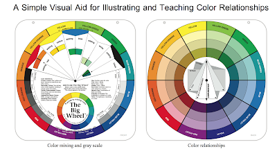
One of the color wheels called Creative Color Wheel seems to have more tints and shades that I can use in landscapes. It also has more than the standard primaries (3), secondaries (3) and tertiaries (6), for a total of 18 rather than 12. There are two of each tertiary: violet-red in addition to the red-violet, for example.
I plan to make sure that I know which of my oil colors best matches the color wheel's colors. Then I will construct 'tint'', 'tone' and 'shade' strips to see if they match the ones on the wheels. It is lacking the mixes of three primaries with all the other colors but the full range of color/hues produces many variations. It might be that having 18 hues rather than 12 adds a fuller range for use that makes up for the lack of the mixes with the three "primaries". For example, the Creative Color Wheel does have a red mixed with violets, blues and yellows on the first side here. And on the second side in the second photo, we see red mixed with the complement or near complements in the tones and shades, assuming that the 'black' is mixed from the three primaries and the tones are mixed with the complement rather than a grey mixed from the "black". But even if the grey is formed from mixes of white and "black", they are really variations of the three primaries, including the complement.
Quick comparison of this color wheel and the Color Wheel Company wheel:


The hue/colors on this wheel are quite different from the standard Triadic Color Wheel. So it will be important to match my paints with this wheel if I am going to use it.
We will be discussing this.
I plan to make sure that I know which of my oil colors best matches the color wheel's colors. Then I will construct 'tint'', 'tone' and 'shade' strips to see if they match the ones on the wheels. It is lacking the mixes of three primaries with all the other colors but the full range of color/hues produces many variations. It might be that having 18 hues rather than 12 adds a fuller range for use that makes up for the lack of the mixes with the three "primaries". For example, the Creative Color Wheel does have a red mixed with violets, blues and yellows on the first side here. And on the second side in the second photo, we see red mixed with the complement or near complements in the tones and shades, assuming that the 'black' is mixed from the three primaries and the tones are mixed with the complement rather than a grey mixed from the "black". But even if the grey is formed from mixes of white and "black", they are really variations of the three primaries, including the complement.
Quick comparison of this color wheel and the Color Wheel Company wheel:
- The Creative Wheel does not have the tones formed for the 12 hues
- The Creative Wheel has many more shades for each hue, but they do not vary much from each other, especially for the blues, violets and reds, perhaps because these hues are lower in value so that adding 'black' will vary the shade by a slight amount.
- The Creative Wheel has many more tints for beach hue, this time with good variation down to almost white.
- As mentioned above, on the Creative Wheel the mixes of the primaries with each of the other hues are actually found by considering the hues on the outer ring for many. And mixes of a hue with its complements or near complements are found in the shades. I still need to look at each mix to see what might be missing.


The hue/colors on this wheel are quite different from the standard Triadic Color Wheel. So it will be important to match my paints with this wheel if I am going to use it.
We will be discussing this.
Color Harmony analysis of a painting start.
I would like to analyze the use of harmonious colors with a small painting of the santa ritas this week. See my start below. As you read this think about what would you do to this painting start to make it more harmonious.
I used this creative color wheel in the field, trying not to think about the names of colors, trying to find a harmonious set of colors that were what I was seeing in the landscape. I started with the violet of the mountain range. My painting version seemed to be a little 'redder' than what I was seeing, but I liked it and wanted to use it, taking liberties (too much perhaps). But this led to confusion about which colors harmonized with this blue-violet, actually called 'blue' on the cmy wheel.
After some analysis, I realized that I overthought this too much: it would seem that a split complimentary scheme of the blue with orange and yellow-green would work well enough.
We will be discussing possible harmonious schemes in the workshop.
This was the start and I thought it had promise. But the final result was overworked. I include the start here for us to analyze the use of complements. (Otherwise, the sky needs to be lightened as does the dark green ridge of trees in the mid-ground. I actually added details to the mountain range for the final result but now that I look again at this start I wish I hadn't touched the mountains).
Last Monday someone asked if we should do a color study in advance or at least look at the colors on the palette to see how they harmonize. Or at least this is what I suggested. But then reality gets in the way; I was trying to put down the colors I was seeing while keeping the theoretical harmonious scheme in mind. It's not easy doing both at once.
I might work on this in the class..... and would welcome any suggestions.
 |
| Santa Rita Mountain Start, oil, 5x7 |
I am going to add the latest painting, after trying to 'fix' items: lighten the sky and the dark green mid-ground trees, add details to the mountain range, add clouds to the sky for added interest and to paint what I saw on that day. Needs work. suggestions welcome (e.g. the comments box below). We did discuss this in class and the general consensus was stat the ground plan needs to be restored to its lighter tint and the mid-ground dark greens need to be darker again. I find the clouds too spotty and will try to fix that. After making these three changes I will reassess.
 |
| Santa Rita Mountain Latest - UNFINISHED, oil, 5x7 |
Classic Pigments
An article on color used in various master paintings: huffington post article "Manganese black. Yellow ocher. Vermilion. Ultramarine. These pigments sound delicious."Look at a van gogh with new eyes; his paint was toxic. But note the beautiful hues and harmony.