Water-Soluble Oil Mixing: Mixing Violets
Post on color mixing with Cobra Water Based Oils.
- Spoiler Alert: Making charts is very time-consuming. I have made many during my 15 years of painting, but I actually always stop after making one or two simple ones. I think to increase the probability of completing a set of color charts, I will take reasonable short-cuts. For example, I used too many reds and blues for this Violet Mixing exercise. If my goal were only to find a bright violet I should have chosen what I would expect to make it (a blue with a red bias and a red with a blue bias). On the other hand some mixes with yellow could lead to some very nice grays. But then we should have gray scales as part of the mixing.
Conclusion:
- Be more selective of my mixing hues to begin with.
- Try mixes with white also (though I put some into my charts as part of each square).
- Do only one half of the grid since they were duplicated here (red mixed with green is the same as green mixed with red) Or
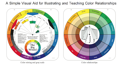
- one dimension of each grid should predominate as is done on the Magic Palette
- Look at other charts to see which seem to be the most productive
- Finally if making the charts just seem to be too daunting, do a few at least and study many others: the Don Finkeldei charts described below, Richard Schmid's charts (google these but I have a book here to show you), Stephen Quiller charts in his book, small charts in various color books, the Magic Palette chart. I plan to study these to see if certain harmonic combinations make the most sense for my trip.
- Study other artists you like. Do color studies of the paintings you admire. I plan to study Doug Higgins' ocean/coast paintings. Since I know his color palette I should be able to approximate his colors His California and Maine paintings are not Hawaii paintings however. So I will study a couple of painters from Hawaii (plein air, especially): I found one whose paintings I admire, Pierre Bouret.
- I reviewed the color charts Don Finkeldei has made to see if this would shed some light on how to go about making charts efficiently. It took him 5 days to make all his charts and his basic colors were cad yellow medium, cad orange, ultramarine blue, viridian and cad red and alizarin crimson plus white . With these colors he is able to mix any that he uses for his landscapes. Have a look: Don Finkeldei's Color Charts for his charts and http://www.finkeldeistudio.com/original-works for his paintings.
- I am not going to spend 5 days now making these charts; instead I am studying them to see if there are color combinations that I can use for the Hawaii trip. Perhaps I will print them out and make color chips (a total of 315 = 9x35 squares)! Then I will arrange them to see which sets make up harmonious colors for Hawaii. In any case, with 6 tubes of paint plus white, Don was able to create all his color charts.
- I have a set of Munsell chips that I did not show the class. I will have them in the follow on sessions. Can these help? There are ten hue sets of each principal color and the secondary and each set has a good range of values and chromes. So, each of these sets has around 30 chips for a total of 300 chips.
- These mixing exercises and experiments will help me decide on my palette. Before continuing I will list my usual landscape palette: cad. lemon, cad yellow light, cad red light, alizarin crimson, ultramarine blue, cobalt blue, cerulean blue, and convenience colors of viridian, with the following in the southwest: yellow ochre and burnt sienna or transparent red oxide. I also often have on my plein air palette a violet such as manganese or cobalt violet.
- The methodology should work for any paint mixing however. You may use any of your own paints for these charts/experiments. I begin by analyzing the mixing of the secondaries. My goal is to determine the best limited palette for use while painting landscapes in Hawaii: mountain ranges, beach and ocean.
- We saw that obtaining bright violets with a red that is biased toward yellow doesn't work very well; the result will be neutralized due to the presence of yellow. Also, using a blue with a bias toward yellow will not be as effective. The ultramarine blue would presumably be the best choice for blue, as its bias is toward red and not toward yellow.
- Unfortunately for this first experiment I did not have phthalo blue; I will add a row later once my order arrives. However, the primary cyan is made up of a phthalo blue plus white, so this might be a good substitute.
- I have always had an alizarin crimson on my palette, but Cobra doesn't even offer it, probably because it is fugitive and might fade quickly especially in washes. In my paint/pigment list below the description of the Carmine is Permanent Alizarin Crimson, so this is used as a substitute. I will have Carmine on my palette. Or the question is: will the Primary Magenta suffice for my red with a blue bias. Which will turn out to be there more useful: primary magenta or carmine?
- I do need to see if any of the tube 'violet's would be useful and/or necessary to substitute for the manganese or cobalt violet often on my palette.
Mixing Violets:
Goal to mix a violet with a red and a blue. We form the mixes from the available reds and blues in my collection.
Analysis: the violets formed from mixing the cadmiums and the pryrrole red with any of the blues is duller, due to the bias toward yellow of their pigments. Pyrrole red is supposed to be a mid shade red but it doesn't seem to make a good violet either.
 | ||
Violet Mixing Palette Before Mixing
|

 |
| Violet Mixing Chart |
Result: the most chromatic mixed violets seem to be in the mixes with primary magenta, which itself is a violet (PV19). And the best seems to be the ultramarine blue and primary magenta mix. The cerulean blue mix is also nice.
I would like to determine which if any of these mixes make a good distant mountain range mix. So I will do another experiment.
First, rather than do a time-consuming chart again, I will study the Magic Palette Chart to try to find the best violets for mountain ranges, for example.
Magic Palette Chart:
(to be filled in).....
Check the pigment details for each paint tube (Clicking on the underlined pigment will also lead back to the Dick Blick site.)
02109-3763 — Pyrrole Red
PR122: Quinacridone Magenta is the most popular name for this pigment. Cobra has two paints with this pigment:
Magic Palette Chart:
(to be filled in).....
Pigments
See Dick Blick Cobra Water Based Oil Paints:Check the pigment details for each paint tube (Clicking on the underlined pigment will also lead back to the Dick Blick site.)
02109-6513 — Violet
This color contains the following pigments:

02109-3763 — Pyrrole Red
We note that PR122 is also found in the paints, Permanent Red Violet. Violet is one of my paint tubes and the one we try to mix with red and blue here. However, since I really don't like to have tube paints on my palette with white I might prefer to use the permanent red violet below.
02109-3733 — Permanent Red Violet

and the Violet.
Note that both paints seem to differ only by the addition of PW7. The proportions would change it also. But white does 'cool' off the violet, perhaps making it bluer.
Two additional paints on my palette:
02109-3783 — Primary Magenta


Pyrrole Red is opaque and has strong covering power. According to manufacturer Ciba, which uses the trade name Irgazin Red, it is a “clean, highly saturated mid shade red with high temperature resistance, excellent color strength, outstanding chemical, solvent and bleed resistance, and good weatherfastness.”
Pyrrole Red, used as an automotive paint and as a colorant in plastics, was developed as one of a range of pigments to replace lead based pigments. In art materials, it is often used as a synthetic and lightfast replacement for carmine, a laked pigment that was originally produced from the body of the cochineal insect. It is also used to replace the older naphthol reds, organic red pigments that are sometimes only marginally lightfast and weather fast.02109-3153 — Carmine

Properties
Benzimidazolone Carmine is a staining, dull red transparent pigment with high tinting strength. Its color is similar to, although somewhat darker than, Rose Madder, the natural source of the historic color Alizarin Crimson. Because it stains and tints much more strongly than natural Rose Madder, care is required to achieve the same effects.
Permanence
Although it is not absolutely lightfast, Benzimidazolone Carmine has excellent lightfastness for a transparent red organic pigment, and as a result, it is often chosen as a more permanent pigment to replace Alizarin Crimson.
We also use the cadmiums on my palette for this experiment.Blue Pigments: I checked the pigments of the blues I used, and found that the pigments were 'pure' for the ultramarine, cobalt and cerulean, single-pigment. The primary cyan is phthalo blue and white.
Magic Palette:
Chart of the Cobra Water Mixable paints with pigments: