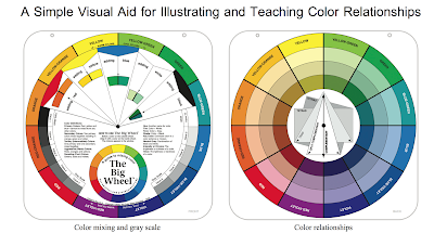
Color Harmony
Color Harmony using the Triadic and the Munsell Color Wheels:
Examples are taken from
- Color Harmony by Margaret Kessler. (In the workshop Go to my Kindle version of Kessler's book for examples of color harmony using the Triadic and the Munsell Color Wheels.)
- Doug Higgins' Website
- (time permitting) Color Choices: Making Color Sense Out of Color Theory (I have an older version of Quiller's book.)
Doug Higgins: www.dhfa.net.
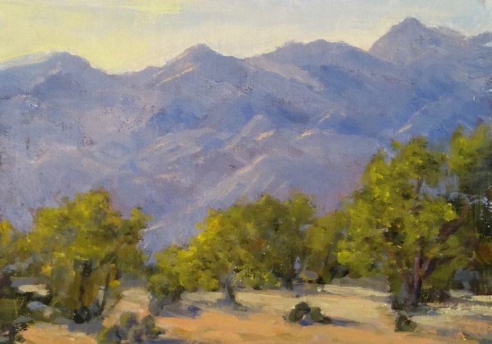
 |
| Doug Higgins, "Canal at Pena Blanca" Oil 20" x 24" |
"High key analogous colors were employed for the reflective surface of the water. The Yellow of the house out in the light is complemented by the Purple Blue of the mountain. The dark Reds in the shade and the Red chimney are complemented by the Green grasses."
 |
| "Old Buckman Road" OIl 24" x 30" |
In the Buckman Road example, "The middle distance cliff is the center of interest and its shadow is mostly Purple/Purple Blue. I wanted Yellow in the near distance for two reasons, as a complement to the Purple and to bring the grasses forward. The Yellow was not as pronounced as I painted it and the complements are detached. When not detached, complements may injure each other where they join. .... This painting is a Yellow/Purple harmony. "
Doug has given me permission to use his article for this workshop and he would love any comments from the workshop participants.
============================
Suggested Exercise: Evaluate your own paintings thinking of color harmony: e.g., were the colors used harmonic? analogous? split complementary?. Can you painting be improved by revising the color scheme or adding a discord?
========================================
WATER COLORS • OIL ON LINEN • 30" x 20" at location:
Image found in Kessler's book: Color Harmony.


Kessler: "I began by toning the white canvas with an overall wash of neutralized red in medium-light values— Quinacridone Red with orange and a touch of Phthalo Blue— to indicate the color theme. I painted the rocks using a variety of tints of both the warm and cool semineutrals revealed by my analogous color scheme stencil. I repeated these rock colors in the trees. I also bounced the rock’s complement (the greenish blue-green color of the trees) into the rocks. The falling water reflects these same colors. You can also combine (on the canvas) some tints of these colors to use for your sky, completing your harmonious color scheme. In this muted painting, it is important to use the discords at full intensity. Bright jewels added in equal amounts as you finish the details will bring your neutrals to life. I placed some discordant purplish blues in the shadow areas of the falling water, and yellow-greens in the foreground (left) tree and the sunlit tree in the upper right."
From: Kessler, Margaret (2012-07-01). Color Harmony in your Paintings (Kindle Locations 999-1008). F+W Media, Inc.. Kindle Edition.
Some of my paintings for analysis and discussion:
go to my website, www.karenhalbert.com
or
consider these examples. Are they harmonic? What color scheme do they employ if any?:
 |
| Chama River Towers |
 |
| Cliff Forms |
 |
| Ghost Ranch Cliff (sold) |
"Ghost Ranch Cliff" (sold
 |
| Ghost Ranch Impression (sold) |
 |
| Madera Canyon Creek (at Quail Creek) |
 |
| Martha's Vineyard Pond |
 |
| Santa Fe River Flows I |
 |
| Santa Rita Mountains (sold) |