Posts

Showing posts from December, 2015

Grammar of Color by Miss Helen Dryden for Vogue from www.munsell.com

Image
Interesting example of a reference to color harmony for Vogue in 1921:  http://munsell.com/color-blog/grammar-of-color-helen-dryden-vogue-proofs/ Part 12 is given here, but at the bottom of this article there are links to previous parts of A Grammar of Color. This example describes an interesting take on color harmony based on an assumption that all the colors in a plate should become a neutral gray when mixed (rather than a mud brown, for example). The use of a circle with the proportion of the colors used is also interesting. Also copied here: A Grammar of Color – Part 12: Two Proofs of a Design by Miss Helen Dryden for Vogue We have been posting excerpts from the 1921 book, “ A Grammar of Color ”, by  T.M. Cleland  with an introduction by  Albert Munsell . The first half of the book focused on explaining how the Munsell Color System works, and suggested ways it can be used. We now start the second half of the book, which consists of some color illustration examples fo

Color Wheel Workshop Follow-up Three

Image
Post Session We had a lively discussion of harmony, based on an analysis of three paintings (plus mine below).  In addition, we enjoyed trying to use online apps to help us in our selection of harmonic colors and will be doing more in this area. Informative article on Facebook on mixing colors using your brain:  Charlotte Wharton: Mixing Colors . Also an article by Charlotte Wharton on mixing greens from her Facebook Page:  Mixing Summer Greens   with an interesting comment about the warm/cool blue debate: " It's important to note that the debate over which blue is warm and which is cool...ultramarine and phthalo blue...continues to this day after centuries of discussion. Although phthalo blue contains yellow and would be thought of as the warmer blue, it makes cooler mixtures of the two blues. You be the judge...after your own experimenting and in what works for you." So, I guess we need to make charts of greens with the phthalo and the ultramarine blue to see for

Color Wheel Workshop Follow-up Two

Image
Dec 14. Objective: evaluate the color wheel's built-in mechanism to select monochromatic, complementary and analogous schemes as well as split complementary, triad, and tetrad harmonic schemes. Please come to the session with a couple of examples of your paintings for harmonious color analysis. Color Harmonies:   We will discuss various harmonies beginning with complementary harmonies.  In particular I will focus on the landscape.  For this reason, I will include for analysis, harmonies of landscape colors. Complementary Harmonies 1: Violet/Yellow, Red/Green, Blue/Orange Complementary  Harmonies 2. Blue-Violet/Yellow-Orange, Red-Violet/Yellow-Green, Red-Orange/Blue-Green For the sake of this evaluation I will use the back of the Big Color Wheel since it does not include the text overlays:   The Pocket Guide to Mixing Color might be useful. You were given this in the original packet. Let's look at it as well. One note is that using neutralized complements mig

Water-Soluble Oil Basics

Why water-soluble Oils for your paintings? - primarily to avoid the toxic solvents.  It is definitely easier to keep brushes and yourself clean: just clean with water. Mixing with water is possible though not recommended after a first wash in.  It's better to use a medium or a thinner, but again the thinner would be used only initially.  For the results of using different mediums check out my post on the water soluble mediums:   There are several good resources on the internet.  I will list them here. http://filarecki.com/water-soluble-oils.html . The classic book on water-soluble oil painting is by Sean Dye: Painting with Water-soluble Oils  (amazon). I used it years ago when I first experimented with water-soluble oils (aka water miscible oils or water mixable oils; we will use WMO from now on). I found the quality of the paints unacceptable; perhaps I was using too much water.  I do know that now that I use Cobra WMO's I find them much better; they were recommended by seve

Water-Soluble Oils - My personal Color wheel

Image
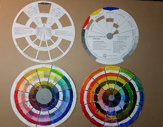
This afternoon I painted a whole color wheel with my water soluble oils, Cobra brand.  I used a quick drying medium gloss gel, Duo Aqua Oil. I was able to paint on the paper easily enough and the paint already seems almost dry to the touch. The result at this stage is fairly matte.  I will see how applying a gloss glaze on top once dry works.   I worked on this for around 5 hours. Here are photographs: Color Wheels with my Water Soluble Oils Color Wheel Front (WMO) Color Wheel Back (WMO) I decided to use the colors I intend to take with me to hawaii, pretty much matching my usual palette: cadmium yellow medium, indian yellow,  cadmium red light,  carmine (to replace alizarin crimson, not available for Cobra), cobalt violet, ultramarine blue, cobalt blue, phthalo blue (or cerulean blue since phthalo blue can be so overpowering), phthalo green (to replace viridian) and titanium white.  Perhaps I will have as convenience colors, cadmium orange and primary yellow, a

Water-Soluble Oils: Modern Primary Mixing

Image
I wanted to see if the Modern Primary palette could be sufficient for a trip to Hawaii. These include the Cobra Water Based Colors: Primary Magenta, Primary Cyan and Primary Yellow and Ivory Black (and Titanium White).  This was another time-consuming chart  The time could have been shortened by doing only half of the chart or by changing the colors on one of the axes to a tint, tone or shade (or all three!). Perhaps one axis could be just the three primaries, similar to the color wheel for its mixing. We still want to try the tints, tones and shades as well. I think the Ivory Black column should be a glaze of black over the color. This might give a better result. Tips (that I did not follow here): a touch of white in the darker colors when mixing would have a more chromatic result and be a better indicator of the mix.  A more inclusive full chart might also use the left axis column for dominant hues; the row's result would have more of the color on this column than the row at the

Water-Soluble Oil Mixing: Mixing Violets

Image
Post on color mixing with Cobra Water Based Oils.   Spoiler Alert: Making charts is very time-consuming. I have made many during my 15 years of painting, but I actually always stop after making one or two simple ones. I think to increase the probability of completing a set of color charts, I will take reasonable short-cuts.  For example, I used too many reds and blues for this Violet Mixing exercise. If my goal were only to find a bright violet I should have chosen what I would expect to make it (a blue with a red bias and a red with a blue bias). On the other hand some mixes with yellow could lead to some very nice grays.  But then we should have gray scales as part of the mixing. Conclusion:  Be more selective of my mixing hues to begin with.   Try mixes with white also (though I put some into my charts as part of each square). Do only one half of the grid since they were duplicated here (red mixed with green is the same as green mixed with red) Or one dimension of ea