Los Alamos Show July 2023 Painting Selection and Analysis Part I
Get link
Facebook
X
Pinterest
Email
Other Apps
6/10/23: Note that several of these paintings are in fact now planned for the exhibit. Some were not (though I still have time to include them in the exhibit - which can be accessed with the qr-code or the link below it in the 5/27 update).
5/27/23 Update with QR-code for immediate access to the Exhibit on my website:
Focus smart phone camera on this QR code to access my website's exhibit.
5/27/23 Changed painting titles to the current names reorganized in May by category, Chromatic Lands, Land Abstractions, Luminous Lands, Turbulent Lands, Turbulent Waters, Turbulent Winds.
April 24, 2023: To prepare for the Los Alamos show this coming July, I am going to decide which of my current paintings best fit in with the theme of the show, Radical Impressionism: A Mathematician Paints. There are some obvious choices - either paintings of the Los Alamos Area or paintings I've analyzed already with the armatures. I will analyze some of these paintings to see how they could be improved - or just to see if they do fit in with the armatures already.
Each Golden Mean painting will be analyzed with a Dynamic Symmetry grid as well as the Golden Spiral and PHI (1.618...) grids. The other paintings will be analyzed with a Dynamic Symmetry Grid at the very least.
I am organizing these initially by Aspect Ratio, but am leaning toward categorizing my paintings as:
Turbulence, Fusion, Luminescence, Prism and perhaps Fractal. So I will list the category for each of these. (changed Prism to Chromatic for the current titles; removed Fusion from the list; changed Luminescence to Luminous)
But first, let's analyze the categories. The definition of luminescence is very scientific and involves a light from a substance that is not heated. Luminance is also a scientific term relating to the RGB components of a color. As I look over my paintings, certain adjectives make more sense than others: if a painting is especially colorful, do I want to use an adjective indicating light or would I want to use an adjective indicting color? What about a painting with movement. I'd like to think that most of my paintings involving water refer to movement, or Turbulence. The color is part of the painting but perhaps it's less important. In addition, for moving water paintings, the light might be less important. I believe that I gave the name, Luminance, to a painting since I was thinking about how to find a color that would make the water sparkle with light. So the luminance of the colors is important. Which colors would I choose. In a formula for luminance, white is considered the color that is brightest, while black is the dullest.
Let's consider here the painting in question: what would be the best title?
Turbulent Waters I (changed from Luminance), 12x18, oil
It's currently titled, "Luminance". Is this the most important aspect of this painting? In reality, just as for my other 'water' paintings, it seems to me that it's the turbulence that matters. But perhaps the brightness of the water is important. Does this stem from the colors in the painting? Does 'G' have a brighter value in the formula for luminance?
The formula for Luminance in terms of the R/G/B components is:
Luminance = 0.299R + 0.587G + 0.114B
We note that the "G" component has more weight than the Red or the Blue.. So perhaps this is why the water is brighter than it might be; it's quite 'Green'. And of course, the white waterfall contributes to the brightness.
Let's analyze 'turbulence'. The definition is:
"violent or unsteady movement of air or water, or of some other fluid"
NEW TITLES
In May I renamed this painting, Turbulent Waters I, and renamed the other water paintings in the exhibit to follow this: categories are now: Chromatic Lands, Luminous Lands, Turbulent Lands, Turbulent Waters and Turbulent Winds plus a category: Land Abstractions.
I found a reference to Turbulence from an analysis of Van Gogh's paintings a while ago. I am reminding myself of this reference.
When the researchers digitized the paintings, it was found that the curves between two pixels had an uncanny resemblance to fluid turbulence. One astonishing discovery was that all these paintings were created when Van Gogh was psychologically unstable.
The Mathematical Interpretation of Van Gogh’s ‘The Starry Night’
How his turbulent mind depicted the supremely difficult concept of turbulent flows
In actuality, the painting I had titled Luminance might be better named with another term.
Let's see:
Definitions:
Luminance: the intensity of light emitted from a surface per unit area in a given direction.
Luminescence: the emission of light by a substance that has not been heated, as in fluorescence and phosphorescence
...
More to come.
4:3 Aspect Ratios
This ratio is the common camera ratio; photos taken with many cameras are initially in a 3 to 4 (or 4 to 3) ratio. The 9x12 is a popular plein air size and can serve as a basis for larger studio paintings with the same ratio: 12x18 or 18x24, or even larger: 24x36.
Turbulent Winds I 9x12 (4:3 Aspect Ratio) (cat: Turbulence)
Recall that the intersections of the main diagonals and their reciprocals (lines perpendicular to the diagonals) are good candidates for focal points. The distance between any two candidate focal point on a vertical is different from the vertical distances to the edges in contrast to the rule of thirds' divisions. This relieves the armature of complete symmetry. Note that the candidate focal points are somewhat closer to the center than the the often used rule of thirds' division points.
So, do we see an obvious focal point here that conforms with the dynamic symmetry grid? My answer is 'no'.
Recommendation: choose one of the points and make the color brighter around that point - or in more contrast in any case. I believe I initially wanted the main mountain to be the focal point, but in reality the painting is about the yellow tree (Palo Verde). So for now, let's choose the yellow tree and make the area at the lower left focal point (also called a sweet spot) more dramatic. The ocotillo flowers lie nicely on the main diagonal, potentially leading the viewer to the yellow tree. There's a strong curved branch of yellow flowers that almost reaches the lower left sweet spot. Perhaps that could be made a little more obvious, continuing it a little more so that it's clear that it is reaching toward the sweet spot. We could even let it cross right through that spot. Perhaps I'll take this photo to Photo Shop and adjust it.
Before experimenting with photo shop, let's consider other possible changes. For example, perhaps we can say that the yellow tree, the ocotillo and the lower right desert plant form a nice triangle (that was the intention). But right now I feel they are all vying for attention. If I put my finger over the desert plant, the painting feels less busy; we have now a calm area. But I feel then that the tree is slightly off-balance. I shouldn't let my innate desire for symmetry dictate what I paint. But perhaps we just need something to replace the rather large desert plant; a smaller one. And we should design it in a way that it leads the eye to the yellow tree . I will try both changes in photo shop (I'm actually in another location right now so that I am unable to touch the painting anyway.)
Something else I could try is to align the main mountain exactly on the nearby 'reciprocal'. Its intersection with the main diagonal could serve as a secondary focal point, a counter balance to the lower-left focal point that we have decided to use as our main focus.
The good news is that I can try all of these in photo shop and make decisions once finished. So, a little later: Photoshopped on the left (I also thinned out the Ocotillo to make it recede). Is this better?
Here it is with the Dynamic Symmetry grid applied (obviously I missed the direction pointing to the focal point; perhaps I should have put the grid version into photoshop. well, I need to practice):
I think that bottom line, the tree should have been a little more to the right. So, perhaps the best thing is for me to paint this again (from my house in Arizona, before it's sold; I think the trees will blossom in the next two weeks and I have one more chance to paint them with the Santa Ritas in the background).
Turbulent Waters III 9x12 (4:3 ratio) (cat: Turbulence)
Turbulence Waters III with Dynamic Symmetry Grid
Where is the focal point? I intended the waterfall to be at the focal point, but it seems to be in the middle of the painting (a little lower). But the part of the waterfall at the lower right focal point seems to be a good candidate for further emphasis, bringing it more clearly to the front of the rest of the water fall. The shadow is darker so there's more contrast. Perhaps a splash or two would give more emphasis to this area.
But I see other issues:
The bigger rock on the left stands out more than I would want. It's such a strong (and actually rather uninteresting shape) I will think about how to de-emphasize it.
I'm wondering also if the background trees recede enough.
In addition the rocks all seem to be the same value so that there's not much depth in the painting.
The three rocks in the immediate foreground are all very similar, though I tried to make them different.
Well, these are a lot of changes, that don't involve the composition or layout I think. We try to start with a good design, but of course, there are other factors such as I've mentioned in this list. I don't like changing a painting, but if I know I can make it better then I think I should.
What I like about the painting:
The strong colors.
The feeling of the water
The background trees at varying distances from each other and with varying angles
Turbulent Waters I 12x18 (4:3 Aspect Ratio) (Cat: Turbulence)
This painting was the cover of a small book I created at Christmas this past year (2022) and used as gifts for family members. I included films with grids to cover the paintings. I plan to work on another version for the Los Alamos Show. But read more about this painting in the post, https://karenhalbert.blogspot.com/2022/12/2022-booklet-of-paintings-with-grid.html.
5:4 Aspect Ratios
Why is the 4 to 5 ratio popular? It lends itself to paintings that are closer to a square than the 3:4 paintings. It might be used for paintings that are not meant to be full landscapes. The 8x10 is a popular plein air size and it can be a basis for a larger popular 16x20 paintings. Even larger canvas sizes with the same proportion would be: 24x30 or 32x40.
Chromatic Lands I 8x10 (5:4 Aspect Ratio) (cat: Chroma)
This is a favorite of mine and I intend to use this as a basis for other paintings. So let's analyze it to see how it could have been improved.
Tao Gorge Power 20x16 (5:4 ratio) Not in Exhibit as of 6/11/23
(not added to the exhibit yet)
I think I will select this painting since the theme fits: the Taos Gorge is powerful - hence the title of this painting completed several years ago. I sold a couple of versions of this scene. And I like this version in particular.
With the Dynamic Symmetry Grid (I decided to use the Wise Photo app in these two cases - for now):
But before applying a dynamic symmetry grid to this painting, I have decided to analyze a different version also. Then I will compare the two versions from the point of view of design.
And with the Dynamic Symmetry Grid:
In the second version, it seems that the brightest sun in the sky is at the upper right 'sweet spot'. Was this an accident, I didn't have these overlay tools available to me when I was painting them, but I did try to place focal point at the upper right as I did.
However, I don't see 'lines' or other artifacts taking advantage of the grid so that they lead the eye round the painting or toward the focal point. I do know that I consciously tried to have an 'S-shape', leading the eye back in space.
This particular painting looks like we might be able to get more out of a full grid with rebated squares as well as the dynamic symmetry.
Now that I look at these paintings with the Dynamic Symmetry grid overlays, I'm not seeing how these are taking advantage of this design. In fact I created these paintings before I began to use these grids. I was conscious of locating focal points away from the center of course. In general I would think of the Fibonacci spiral leading toward the focal point. However, with this non-golden rectangle size, it's not supposed to work with this overlay. Perhaps letting the grid chop of the right and left edges would do. To be continuied......
Chromatic Lands III 8x10 (5:4 Aspect Ratio)
Other Ratios
The 8x16 and 11x14 panel sizes are popular in the field. In addition they both have interesting mathematical properties with respect to the golden ratio of 1.618 (or PHI).
Luminous Lands 8x16 Aspect Ratio 2:1
Sabino Canyon 11x14 Not in Exhibit as of 6/11/23
Golden Ratio
The golden rectangle with ratio of 1.618.. has been well known as the panel proportion that is the most pleasing since antiquity. (The inverse is 0.618..) An approximation to this would be the ratios of 5x8, 8x13, 10x16, 12x19 or 15x24. An even larger studio size that approximates this ratio is: 20x30 or 24x36, which are really 2/3 size or .67. I have used the golden ratio proportion panel for many years but have recently been using the standard sizes in the field of 6x8, 8x10 or 9x12. In addition, I am fascinated with the 11x14 ratio and this is very doable in the field within 2-3 hours.
Turbulent Waters II 12x19 Aspect Ratio 1.5833..
Turbulent Lands IV Borrego Springs 10x16 Aspect Ratio 1.60 near Golden Ratio
Turbulent Lands V. 15x24 Aspect Ratio 1.60 near Golden Ratio
Old Title: Chama River Canyon Wilderness
Chromatic Colors III 8x13 Aspect Ratio 1.625 near Golden Ratio
Turbulent Lands I 10x16 Aspect Ratio 1.60 near Golden Ratio
I painted this (originally titled, Fusion Cliffs) in the studio during the 2022 Los Alamos Paint Out and Show event sponsored by the Plein Air Painters of New Mexico. I've analyzed it extensively in other posts in this blog.
Luminous Lands I 10x16 Aspect Ratio 1.60 Near Golden Ratio
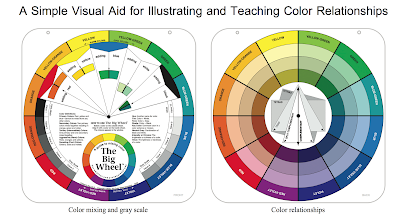
We will be using the triadic color wheel from the Color Wheel Company to illustrate color relationships. a good resource is the book, Color is Everything, by Dan Bartges, a book with thorough descriptions of this tool (I will have it in the workshop for you to peruse). Triadic Color Wheel from the Color Wheel Company: Study of the Triadic Color Wheel. The color wheel provides 12 hues around the circle on each side On the one side we can see the effects of mixing red, yellow and blue and white and black with each of the 12 hues by rotating the wheel. This side also has a value scale that can be matched up with each of the hues to identify the value of each hue. The second side shows the tint, tone and shade for each of the hues. Directions are provided for determining analogous colors, complementaries , split complements, triads and tetrads. We will be discussing these at length. For a preliminary website link with definitions see: http://www.tige...
A Brief Presentation of Several Compositional Armatures Rule of Thirds PHI Grid Golden Triangle Dynamic Symmetry Expanded Dynamic Symmetry Harmonic Armature Fibonacci Spiral Vanishing Point Grid Informal Subdivision Golden Mean "Caliper" System Orthogons Divisions into Fifths (Kimberly Elam) Introduction As a Mathematician, I have become intrigued with several Armatures used by current and historic artists. In this post I have applied the armatures to several historic paintings. I wanted to analyze the armatures further. Which ones seem most helpful? I have tried to choose examples by artists that consciously utilized the given armatures. I may use one example for now, but have to select the most appropriate for this analysis. Many historic paintings have used a complex design scheme consisting of more than one armature, but I will begin with a simple armature. But for example some classical works were based on combinations of Root 2, Root 5 and Golden Spiral armatures. We ...
11/17/2024: I had forgotten how much I wrote on this post. Much of this material was used for the 2023 workshop I taught at the Bluebird Studios in Santa Fe. After writing this blog post I decided to use word documents to maintain the notes. The 2024 workshop was given as a continuation but due to the review of the concepts in the workshop new students attended as well. For more information, visit the Workshops' tab on my website: https://karenhalbert.com/ . Plans are being made now for a 2025 workshop. 10/4/2023: Extensively revised in a separate word document, simplified with the addition of images. A 'flip book' has been created that should be kept up-to-date: https://online.flippingbook.com/view/82714269/ 10/2/2023 Initial outline for a workshop that covers several armatures or grids that can be used by painters during the composition phase or the post-analysis phase. Composition Armatures ...


.jpeg)