Review of Session 2:
We discussed a video from Phil Starke's online blog:
http://www.philstarkestudio.com/between-the-palette-scrapings/, the lesson:
Learning How to See a Painting from a Photograph
and looked at it briefly. Your
implied homework was to review the whole lesson, as he has several photographs he analyzed.
HOMEWORK: you should bring in a photograph or two to analyze for your own painting in Session 3. Alternatively, look at the Session 1 photos, for the Sunlit Santa Rita Mountains, QC Golf Course at the End of Day, Santa Ritas from Suaharita and the Mountains from the Sales Office. If you don't have a copy of the photo you want, let me know and I will print it out. See end of this post for some analysis of a photo, with value studies.
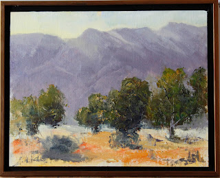
I continued my demo on the Santa Rita Mountains, with painting photo reproduced here again:
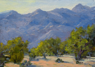 |
| Santa Rita 5x7 painting reference |
 |
| Class Demo at end of Session 1, block-in stage |
The shadow pattern of the mountains was lost during my demo. It should be part of this block-in stage. For Session 2 then, I attempted to correct this. I did not take a photo unfortunately, and then we got caught up in creating the right values. Another step we took was to try to vary the main shapes: adjusting the tops of the mountains and the tops of the trees. In addition we made the trees smaller, more similar to the size of the trees in the reference painting.
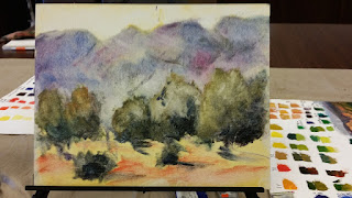
 |
| Santa Rita Demo near the beginning of Session 2 |
Painting in the sky allowed us to reshape the top of the mountains. And of course, adjusting the mountains allowed us to reshape the trees. at this step, it was clear that the mountain ridge was too hard-edged as well. Softening the tops helped, but during session 3 we will analyze next steps (besides painting a lighter tone to the upper left of the trees and repainting the prickly pears) perhaps continuing with the painting.
 |
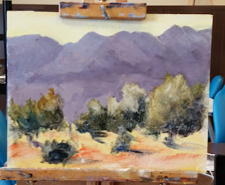
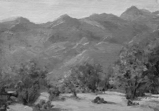
| Santa Rita Demo at end of Session 2 in a modest frame |
 |
| Santa Rita Demo at end of Session 2 in gray scale |
I discovered something interesting while repainting the mountains: I thought that the values of the 'purples' I had created were correct. When I applied the paint to the canvas it was clear that they were too dark. So I adjusted the values until they seemed correct, allowing the mountains to be pushed back. Note that since the mountain colors were variations of the same 'purple' mud was not created. It might be that I use a mid-tone neutral color for my palette but the canvas was very pale so that the values were not seen correctly.
A criticism of the painting at this stage is that the light value of the mountain seems too white (and therefore chalky) to me. If I truly wanted to replicate the reference painting, this has not been achieved.
Details: This demo was painted using:
- Cobra water-based oils, with the medium, Gamblin solvent-free gel (liquid form).
- The palette paints were: cadmium lemon, cadmium yellow medium Indian yellow, cadmium red light, carmine (similar to Alizarin Crimson), Ultramarine Blue, Phthalo blue and Titanium White.
- Purple: I mixed the 'purple' from the Ultramarine Blue and cadmium red light plus white. I used more red than I expected, but otherwise the mix was almost black. Note that Cad Red Light has a yellowish tone so that the 'purple' is appropriately muted.
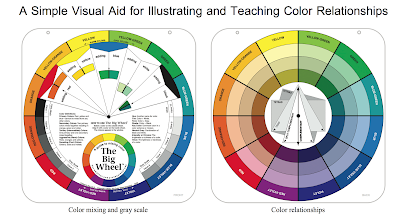
- Green: The 'mother' green was a mixture of Indian Yellow and Ultramarine blue, A Cadmium yellow medium mixed with Phthalo blue could also be used (plus a dab of red perhaps). Variations of the greens should be mixed for analysis: lighter greens may be attained by adding more yellow, seven the cadmium lemon. Adding white will cool the greens, for the cooler greens. Try to mix a light and dark warm green and light and dark cool green.
A suggested HOMEWORK exercise is to use your paints to mix an appropriate purple and black as well as a warm and cool mother green.
The main demo steps were:
- Tone the canvas using Indian Yellow or a light wash of whatever yellow you have. Some suggestions are: Transparent Orange (Gamblin) or Yellow Ochre, very thin with water or thinner (water-based) or gamsol. Alternatively (solvent-free) is the Gamblin solvent free gel or liquid or M. Graham Alkyn/walnut oil mix.
- Underlying wash-in with approximate transparent colors (no white)
- Block-in with approximate colors (with white now).
I did not do a value study since I was basing this demo on a given painting (though I did look at a gray scale version of the painting):
 |
| Santa Rita Demo Reference photo in gray scale |
But generally, preliminary steps should include:
- a value study, even a black and white notan study to get a clear idea of a good dark and light pattern
- a 4-value landscape study for the 4 values: uprights, slanted mountains, ground and (lightest) the sky
- a block(color) study with 5-7 main blocks for the painting, using values from the 4-values and/or using approximate colors.
- perhaps a pencil sketch of the scene
- I like to use Photoshop elements to analyze a photograph. In fact, for the purposes of demonstration, Phil Starke seems to use photoshop in a similar way. Perhaps I will try to 'repaint' the photo in Photoshop. ALTERNATIVELY, I have seen people paint right on top of a photograph, with 5-7 major shapes and colors.
I will attempt to analyze a photo from Session 1 and include these preliminary steps here. I did do a painting of the Sunlit Santa Rita Mountains. The mountains need to be cooled as we noted last wek. Later I will analyze the photo in B/W and do a notan sketch as well as a 4-value study, and perhaps an initial color study. I am going to post a photoshop analysis now.
To review:
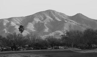 |
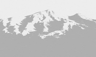
| Sunlit Santa Rita Mountains BW |
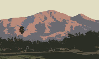
I had two photos of these scene, one with trees in sunlight. It might be a better painting but the trees compete with the mountains. We should analyze how to treat the other version, making the decision which is the focal point In this photo we have chosen to focus on the mountains. In particular we should choose which portion should have the highest contrast; the range should not be all the same.
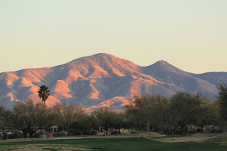 |
| Sunlit Santa Rita Mountains Photo Reference |
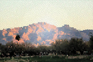 |
| Sunlit Santa Rita Mountains Photoshop Stainglass Filter |
I continued to experiment (again) with some Photoshop Filters and Adjustments and got these:
 |
| artistic notepaper filter |
This appears almost like a Notan sketch, in which everything is either light or dark. This really accentuates the dark and light patterns and helps us determine what to keep and not to keep. I like the shadow pattern.
 |
| artistic cutout filter |
In the cutout view we can almost get a four value sketch, with some color. I converted the cutout to BW (totally unsaturated) and got this, very similar to our original B/W:
 |
| artistic cutout filter BW |
This seems to capture the 4 values of the landscape: darkest uprights, middle dark slanted mountains, lightest sky plus the ground plane. The ground is in shadow here so this is a different value. Even the lightest ground though seems darker than the lightest part of the mountain. The problem with using a photo that has shadow, is that the simple value scale doesn't quite work. We need to begin to discuss shadows and their effect.
 |
| artistic palette knife filter |
Palette knife is always interesting. There were others but this seems to capture the best.
Also, if you have the Bob Rohm book, he includes photo references and some value studies. He's the first instructor I had who used a 4-value scale faithfully for all his demos.
Oh, and i do want to include the painting of this scene I did a while ago. I am not happy with it and would want to spend another session on it as we discussed at the last meeting (cooling the mountains, for example).