Feb. 19
=========================
Session 1 Review. In the first session we covered most of the topics in the Session 1 post. I did not cover other artists' work. I did do a demo of the first stage underpainting for a copy of the painting, "Santa Rita Mountains" below. I used Cobra water based oils with Gamblin solvent-free liquid as the medium.
- I painted "Santa Rita Mountains" en plein air last year and entered it in the Colorado Plein Air Artists Annual show, a difficult show to enter. We discussed what made this painting work and used it as a guide for the day's demo.
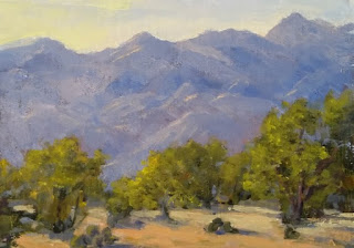 |
| '"Santa Rita Mountains", 5x7, oil, sold |
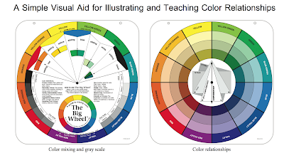
- Toning: For the demo I used a linen panel toned with Indian Yellow, similar in mass tone to Transparent Orange. An advantage of Indian Yellow is that it makes a very nice pale yellow when mixed with white, so that it serves multiple purposes. As I experiment with it more, we will analyze this further.
- Underpainting: Primarily used ultramarine blue and Indian yellow for the underpainting, using the cooler blue to make the mountains more distant and the warmer yellow to bring the trees forward. The viewers seemed to appreciate my style of pushing/pulling, wiping out paint to make an area lighter, sometimes scraping and wiping if I made an error. The main intent here -was to enjoy the process and not get all wrapped up in details. Note that later stages will be different. It is better to have a clear idea of what you want and not be changing too much. And if a change is necessary a full wiping out is better than trying to apply color on top of color. (This holds for palette knife work as well, even if the underlying paint could be covered up more easily.) Note that once dry, wiping is not necessary, but care must still be taken since the underlying color might still show through the top layer, which is sometimes a good thing.
These are snapshots of Session One's underpainting, using only transparent washes with non-whites. Note that initially I used Ultramarine Blue and Transparent Yellow but began to add some Carmine (red) to add some color to the mountain range. I mixed the blue and the yellow to paint the trees in front of the mountains. Then I added some cadmium lemon to the upper left of the trees to make them more sunlit (but later repainted this area and wiped it out).
Discussion:.... First note that we were copying a painting here so that the values and colors were there for us to replicate, In theory, for any new painting, first steps are to evaluate the photograph, cropping and adjusting as needed, marking the 4 value planes (at least mentally). Doing thumbnail sketches, black and white no tans (two values) or 4-value studies are recommended. A color study would be a next step.
I highly recommend a book by Elizabeth Tolley, "Oil Painter's Solution Book - Landscapes", $22.99 on
Amazon.com:. It seems that only the paperback version is available; the spiral bound is very useful. She has included several full demo's from start to finish that are worth studying, whether you are a beginner or more experienced. I will have the book in class for you to peruse. Another book highly recommended is "Color Harmony in Your Paintings" by Margaret Kessler, $20.98 on
Amazon: Her demos are particularly pertinent since they include Arizona scenes. Elizabeth's examples and demos are primarily from California, but much of the Californian landscape is in fact similar to Arizona's. (See in particular her prickly pear painting under the section, Double-Complementary Color Scheme.)
In fact, of more pertinent interest to this session would be the painting, "Cathedral Lights", found under the Complementary Neutrals' section.
"Santa Rita Home"
This is a painting I did a while ago. I incorporated my view, but eliminated much. I hope to redo this as a friend wanted this painting. I was thinking of the Taos School artists and how they would incorporate old Santa Fe adobes in the foothills of the Sangre de Cristo Mountains. This would be a painting of Quail Creek's Santa Rita Mountains with its Santa Fe style homes. Here is a photo of my view.
In session 2, before I work on completing the painting I begun in Session 1, I intend to have a look at some of the lessons posted by local Tucson artist, Phil Starke. He has a blog,
http://www.philstarkestudio.com/between-the-palette-scrapings/, well worth studying, with several VERY informative demo's. He doesn't always use Arizona landscapes, but you will find many examples of his Arizona paintings on he 'painting' website,
http://www.philstarke.com.
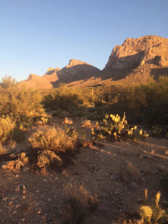
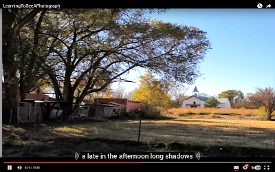 |
| Phil Starke's Demo Original Photograph |
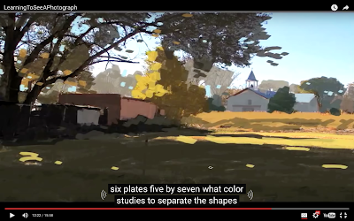
This series is from the Phil Starke Teaching blog,
http://www.philstarkestudio.com/between-the-palette-scrapings/, in particular, the lesson with the title, "Learning how to See a Photograph". The end painting is part of the lesson with the title, "Using Color Schemes". I highly recommend that you look at the videos on the blog. We will glance at them in the class. But I wanted to include here a sampling of what you might find on the blog. Also, I copied a downloadable free checklist above. You may find this in this "Photograph" lesson.
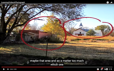 |
| Phil Starke's cropped image with focal point analysis. |
From the photograph Starke chooses a cropping that makes sense and helps eliminate non-interesting or cluttered areas. He analyzes it to determine the best focal point,
 |
| Phil Starke's blocked-in version. |
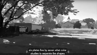
Starke visualizes a blocked-in version. This takes time and experience to get to this point. He is demonstrating what he envisions, with the help of photo-shop here. He tries to visualize the main shapes and their value/color, keeping the number of shapes and the value/colors limited. I am including a B/W version. Starke emphasizes values and he has a lesson on Values as well.
 |
| BW Version of Phil Starke's Blocked-in version |
It's always a good idea to construct a BW thumbnail of different versions, using at most four values. This BW image has more than 4 values. His ground plane appears lighter than the sky in the BW version, at least close to the dark shadow.
Discussion in class: ...
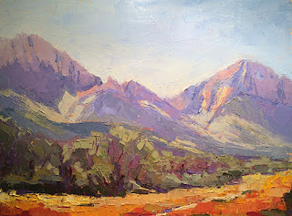
 |
| Phil Starke's Resulting Painting from the lesson, "Color Schemes" |
Note that Starke chose a Secondary color scheme, with orange, green and violet predominating.
Addendum: I just received a link to an article about a local Tucson painter, with paintings I love! Have a look and let's discuss them:
http://www.outdoorpainter.com/my-favorite-place-to-paint-barbara-mulleneaux/.
Here's a photo and sample paintings of different locales:
 |
| View of Tucson Mountains |
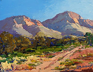
 |
| “FEBRUARY AND 80,” BY BARBARA MULLENEAUX |
 |
“YOU CAN FIND ME HERE,” BY BARBARA MULLENEAUX, OIL, 8 X 10 IN.
|
And just curious......