1. QC Solvent Free Oil Painting Class Session 1
There are at least three sessions that will be plein air: Feb 12, Mar 11 and Mar 18. Also, I will not be here the last Friday of March, the 25th (but will assign homework. I will be in Sedona painting and gathering photographs for you to use.)
Updates: I added a series of stages for the painting, "Taos Gorge Aglow". I will have its companion, "Taos Gorge Awakening" in the first session.
This is a list of what I expect to cover over the first few sessions. I initially thought 1 session but there is a lot of material here. And I plan to use only 1 hour for as much as we can cover. Then you will paint for two hours. Perhaps we need to decide: do we spend time analyzing photographs for what to paint or do we do some under paintings, using photographs as is?
1. Introduction. Show some of my paintings with general discussion of these as we go through the other sections. Paintings to include:
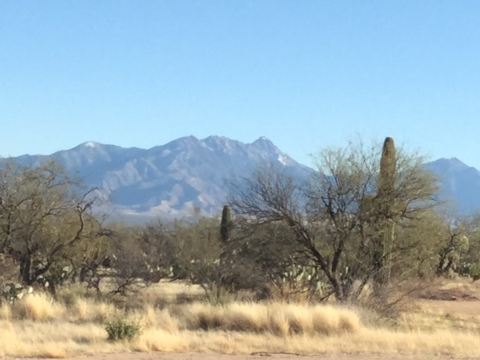
Santa Rita Mountains:
 |
| Gray scale: Santa Rita Mountains |
 | ||
|
I would love to do a larger version of this with improvements. I started one and will have the start in the first session. Actually, it's nearing completion. I needed to use up all the paints on my palette, mixtures I made from only three.
Taos Gorge Paintings. Note that another even larger version is at the Marigold Arts Gallery on Canyon Road, "Taos Gorge Aglow". See end for painting stages for the Taos Gorge Aglow
 |
| "Taos Gorge Warmth", 14x11, oil, "en plein air" |
 |
| "Taos Gorge Awakening", 20x16, oil |
I would love to do a Grand Canyon East Gorge version of this
QC Sunlit Mountain (see below)
QC Golf Course End of Day Portion (See below for Initial underpainting)
2. Photo Image Analysis
Key elements to look for: main idea or concept to convey, focal point, composition, good value contrast, Move an object if it makes a better painting. Think about lead ins (road, arroyo, stream, path directing the viewer toward the focal point).
Think about the following photos for potential paintings. What attracts you or doesn't.
QC Sunlit Mountains.


Portion of photo:


Arizona Calendar Organ Pipe National Monument, Oak Creek. Note in this photo the zig-zag path leading up the hill. The more one studies the photo the more one sees. But, just as in plein air, time should be spent analyzing a photo to see what it can offer.

Metcalf's painting reminiscent of this photo, though a different subject.


Albuquerque's Sandia Mountains, an image for a painting that I would like to do. But use elements from this image to enhance the Sahuarita photo, perhaps. It could be horizontal. The photo just has a nice arroyo in it. I tried to take a photo of the Santa Rita Mountains with an arroyo but haven't done so yet.
 |
| Sandia Mountains, Albuquerque, NM |
Sedona Cliffs from Road with DH painting - to be added
Sedona Cliffs closeup painting by AH - to be added
3. General concepts at initial stage.
At most 5-7 major shapes. Focal point at intersections of thirds (dark/light, crisp vs soft, bright against dull, complementary colors next to each other to attract attention). Good lead-in to focal point Initially think 4 values: darkest (upright), lighter darks (slanted mountains), ground plane (darker lights) and sky (lightest). Note: there can be an accent or two (but not too many and not too scattered), either 'white' or 'black', lighter and darker than in our 4 value scheme Can refine within each value-plane if needed.
(See Carlson's treatise on Landscape Compostions). Hand out Bob Rohm's painterly checklist and page on values. Think unequal measures (make trees different sizes with irregular shapes - no lollipop trees). So change the distance between trees if necessary. Think straight edges.: curves made up of straight edges.
Note: two thoughts to keep in mind: do not try to copy the photograph since photographs lie, but also the painting should be your creation. Let it be the jumping off point. Refer to the photo for details if needed, but try not to thick about details Think of big shapes, not the shape of leaves. Think about the mood.
The first stage should/could be very loose. Do NOT worry about details. Even the color can be not quite right though the value should be accurate.
Master Artist and Author of an excellent book, The Painterly Approach, has given permission to use his Painterly Checklist, which I have found succinct and invaluable:

I will be handing out his notes on the use of 4 values as well.
Exercises (at home if desired):
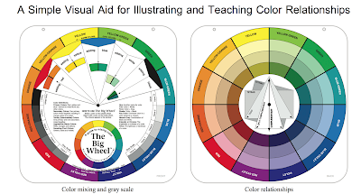
Construct value charts and color charts. (See my 3 color Color Chart at end of this post). Find the values for a given color. Darkest will be blues on our palette with yellows the lightest. And white of course. Note that white cools everything, sometimes too much. So for example should you add white to yellow, the result will be duller than the pure yellow. But landscapes are muted. Relationships might make something seem brighter (or sunlit). Mix natural looking greens from your yellow(s) and blue(s), even using black in place of blue for one mix. Touches of red should be in the green to neutralize the green. Note that cad yellow medium and Indian Yellow have some red in them. And so does ultramarine blue. I find that yellow ochre and blue makes a nice cool color that can be used for more distant trees. Mix natural looking violets for the landscape and neutrals in general. Note that if you look at the color wheel, the colors on the outside of the wheel seldom occur in nature. The interior colors are more natural. We mix all our colors from 3 or 6 main colors for harmony and as a good learning experience of what the colors can provide. Note that I actually like to use more convenience colors than I should. I have several neutrals and variations of blue. I also have used transparent oxide colors and/or burnt sienna a lot but am trying to see if I can do without. I do use Viridian as a convenience color but it's especially good for a light-valued horizon "blue" color when used to tint white. And it makes a beautiful transparent dark when mixed with alizarin crimson or carmine
5. Painting - Preliminary Stage. Select a photo with an idea that appeals to you. Identify the main idea and the focal point (not necessarily the same). Crop it in various ways, keeping the focal point off-ccenter. Select a cropped version. Ideally the photo should have been taken perfectly without need to crop. From the photo create a B/W version, notan or value study, color study, with up to 5-7 major shapes, each one with a its average value/color.
6. Painting - Stage 1- Underpainting. Do an underpainting using no whites if possible, perhaps leaving the canvas alone for the lightest color (e.g., sky). Mark the darkest accent with a mixed black next to a lightest areas (pure canvas say). Use medium freely if desired, but I will try to do an underpainting without medium also.
My underpainting for QC Sunlit Mountains, using only non-whites

7. Stage 2. Mix some of the main colors that you see in the photo comparing the mixes with the photo. Keep in mind at all times that white cools the color. For atmospheric perspective make the colors in the background cooler, lighter and more neutral. Warm, bright colors come forward, especially yellow and orange. Yellow fades from colors as they recede. Hence a mountain cliff should not be a bright yellow. A touch of purple, yellow's complement, neutralizes yellow, but if the purple has too much blue the resulting mixture can be too green.
8. Analysis of My Paintings for the class:
QC Sunlit Mountains painting
My Painting (failed but how to fix it is to be analyzed at some other point):


9. DEMO (perhaps saved for the session on Feb 19):
a. QC Golf Course End of Day full painting start or
b. Santa Ritas from Sahuarita start
10. Painting Stages for the "Taos Gorge Aglow", 24x18, oil at the Marigold Arts Gallery. Missing a photo of the underpainting stage, with no whites.


 |
| Mixture for two darks: cooler mix on left. |

Paints used for the "Taos Gorge Aglow": Williamsburg Oil, Indian Yellow, Yellow Ochre, Fanchion Red, Carl's Crimson, Ultramarine Blue, Phthalo Blue and Titanium White, and Transparent Red Oxide for the underdone. with M. Graham Alkyd/Walnut oil as a medium. Notice the layer of half-tones.
10. Initial Charts


11. My Mentors and Sample Paintings with Analysis (to be added)