I spent some time recently creating this very small 4x5 booklet of some of my paintings with Vista Print. I wanted to illustrate how one might analyze paintings using grids just as historic artists might have used.
I made transparencies of various grids to be superimposed over the paintings with a ratio of 3:4 (9x12, 12z16 and 18x24). Here's an illustration from the book, but have a look at the transparencies in this post below.
The transparencies are not permanently in place. This allows the viewer to mix and match transparencies. One idea would be to see if any particular grid is more effective.
You might want to read the posts on applying the grids to other paintings; eg, my post on Design Armature Examples applied to the Santa Fe River Turbulence). I go into detail about the different grids including the Andrew Loomis' Informal Subdivision. But I will make a few descriptive comments here also.
You may also search through this blog using the search bar above. Alternatively, search through the posts listed at the right, selecting a post with a title that looks 'promising' or selecting from the labels.
Since the grids were small I used a word document to hold two grids on a page and printed then onto 8 1/2 by 11 sheets of transparencies. Then I cut the transparencies so that the grids would slide into the booklet and match the borders of the paintings. Before inserting any grid into the word document I made sure the size fit the size of my book (in this case, 3.487 x 4.68). The images used for the grids are PNG, created from screen shots of the grids. These grids are made for the 3/4 proportion, the same proportion used by most cameras. If one tries to 'stretch' the grid to fit a different proportion its properties would be lost. The Dynamic Symmetry grid requires that the lines from the corners intersect the opposite main diagonals at right angles (90 degrees). This will create the maximum 'thrust'. And 'stretching' this rectangle to be a different proportion changes that angle.
Tip: you may select any of these grids to download for your own use. Then print it on a transparency yourself or drag it over an image with proportions 9:12 in Photoshop. Then take a screen shot. You might need to change a layer setting to 'multiply'. See the post: http://karenhalbert.blogspot.com/2022/12/example-grid-overlay-on-existing.html
Rebated squares (discussed elsewhere) were used historically to achieve harmony. In articular, Root Rectangle rebated square grids exhibit nice properties.
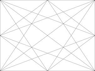
Combining these two grids leads to a nice overall grid with many diagonals to use to guide the viewers as they scan the paintings.
And then I had fun creating a few "informal subdivision" grids. Visit my blog post on an introduction to the Andrew Loomis' Informal Subdivision method here:
In the first example below I began with a point in the 9x12 frame that would be the intersection of a main diagonal with a 'reciprocal' perpendicular to the diagonal. I hoped this would be an energetic point from which to begin the subdivision process. I drew horizontal and a vertical lines through that intersection and then looked elsewhere for a point that I could use for my next set of diagonal/horizontal/vertical lines. And continued from there.
It turns out that when I checked the position of the "eye" in this second example, against the grid, Dynamic Symmetry with Rebated Squares, the eyes don't line up exactly; they are not on the same horizontal line. If superimposed, one can see that the 'reciprocals' don't line up either; one of them does not meet the main diagonal at a right angle. The booklet as promoted then has an informal subdivision grid that is not perfect. But in fact, an informal subdivision grid could begin at any point in the rectangle, according to Andrew Loomis.
Superimposed Informal Subdivision Grids with unmatched reciprocal diagonals:
I am discovering that it's difficult (for me) to measure accurately by eye on the computer.
In another example I experimented with a different "eye" or potential focal point, a little higher and to the right just to see how this grid might work. I chose a point along the rebated square vertical line.

Since the Informal grids are asymmetric, the viewer can rotate the grid to find a focal point in another quadrant, if that matches your subject:
Well, this is enough playing around with the informal subdivisions. They are fun, but perhaps it's time to compare other grids. For example, does the Harmonic Armature yield 'better' diagonals and potential focal points (or "eyes" that can be used as focal points). As discussed elsewhere and proved, the standard eyes from the Harmonic Armature are at the thirds, so that it's an extension of the Rule of Thirds (ROT) that artists like to use when designing a composition.
Harmonic Armature:
I could write a whole post on the Harmonic Armature.
We note in passing that the Harmonic Armature can be stretched to any proportions; its properties are unchanged. This might be one reason to use it; it's simpler to construct. and is more flexible.
The book page example at the beginning shows how a page looks with a transparency superimposed. For the purposes of this post I will include now images of a 3x4 painting with transparencies superimposed using photoshop and saved as independent images. The book could have been created with these combined images but then the viewer could not try different grids. Or the book would have to be created with 6+ grids for every painting.
And another:
I included a golden rectangle painting in the booklet but without a grid, The Santa Fe River Turbulence. I have superimposed a Dynamic Symmetry Grid on this painting here. Visit my blog post on this painting with armatures for a fuller explanation of the grids in general and how an artist might use them: click
Santa Fe River Turbulence, 10x16, oil
Santa Fe River Turbulence with Dynamic Symmetry Grid
and adding the Rebated Squares:
Santa Fe River Turbulence with Dynamic Symmetry plus Rebated Square Grid
and finally a superimposed harmonic armature grid:
Santa Fe River Turbulence with Harmonic Armature
How does this Dynamic Symmetry plus Rebated Square compare with the Harmonic Armature?
Comparing these two 'grids' I see that they both use the main diagonals. But the Dynamic Symmetry grid then has 'reciprocals' perpendicular to the main diagonals while the Harmonic Armature has lines from the midpoints through the main diagonals to the corners. I prefer to use the intersections of the main diagonals with the reciprocals as a focus rather than the points at the third marks; the perpendicular reciprocal creates maximum thrust.
I hope this post provides some insight into grids used over the millennia by artists from the pre-Renaissance period to the Modern one and perhaps even more important how an artist might use grids to design or analyze a painting.
To be answered yet: which grid is the most helpful? Perhaps a continued pursuit might provide insight.
Watch this blog for more posts from this Mathematician turned Artist.


