Anatomy of a Seurat Painting and Santa Fe River Turbulence by Halbert
A Brief Presentation of Several Compositional Armatures
- Rule of Thirds
- PHI Grid
- Golden Triangle
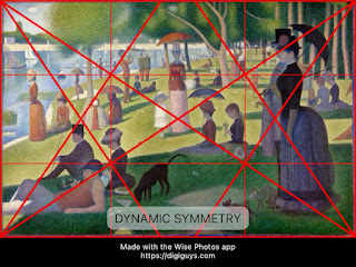
- Dynamic Symmetry
- Expanded Dynamic Symmetry
- Harmonic Armature
- Fibonacci Spiral
- Vanishing Point Grid
- Informal Subdivision
- Golden Mean "Caliper" System
- Orthogons
- Divisions into Fifths (Kimberly Elam)
Introduction
I wanted to analyze the armatures further. Which ones seem most helpful? I have tried to choose examples by artists that consciously utilized the given armatures. I may use one example for now, but have to select the most appropriate for this analysis.
Many historic paintings have used a complex design scheme consisting of more than one armature, but I will begin with a simple armature. But for example some classical works were based on combinations of Root 2, Root 5 and Golden Spiral armatures. We will explore them more in another post.
One new scheme, mentioned by Kimberly Elam in the Geometry of Design states that a very popular point was used by the Renaissance artists: at the divisions of fifths: points are 40/60 divisions then (actually close to 38/62). She called this point the Golden Section Point. I can't find any reference to this though and she doesn't cite it.
I used the Wise phone app for most of the overlays.
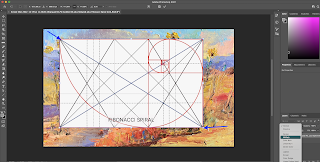
I have included images of the overlays on a blank canvas for better visibility perhaps.
Observe that some of the Wise overlays work only with a golden rectangle (the red rectangle lines indicate this with extra space around the rectangle:) PHI Grid, Golden Triangle and Fibonacci Spiral.
Addendum June 2023: in fact the Dynamic Symmetry Grid seems to work best with 4:3 proportioned panel or approximations thereof, a popular camera proportion.
Addendum Oct 2024: the Dynamic Symmetry Grid also works with another camera proportion a 1 to 1.5 grid.
Armatures
Rule of Thirds: Most artists use this rule - at least subconsciously. In general we have learned NOT to put the painting's focal point in the center of the paintings (or at least understand when and why we decide to put our main painting focus in the center). A (mental) division of the canvas into thirds with horizontal and vertical lines helps avoid this. And it helps the painter begin his/her design to mark the 4 intersections of these lines to help identify one of these as a possible focal point.
I will choose an example of a painting that clearly works with the ROT and then continue to use the example until an armature does not fit.
I think I will try one of my favorite paintings:
Seurat (used complex schemes but let's see which of these work), According to Wikipedia:
"Seurat's artistic personality combined qualities that are usually thought of as opposed and incompatible: on the one hand, his extreme and delicate sensibility, on the other, a passion for logical abstraction and an almost mathematical precision of mind."
"Seurat was also influenced by Sutter's Phenomena of Vision (1880), in which he wrote that "the laws of harmony can be learned as one learns the laws of harmony and music".[29] He heard lectures in the 1880s by the mathematician Charles Henry at the Sorbonne, who discussed the emotional properties and symbolic meaning of lines and colour. There remains controversy over the extent to which Henry's ideas were adopted by Seurat.[28]"
https://en.wikipedia.org/wiki/List_of_works_designed_with_the_golden_ratio
While the golden ratio appears to govern the geometric structure of Seurat's Parade de cirque (Circus Sideshow),[31][32] modern consensus among art historians is that Seurat never used this "divine proportion" in his work.[33][34][35]
The final study of Parade, executed prior to the oil on canvas, is divided horizontally into fourths and vertically into sixths (4 : 6 ratio) corresponding to the dimensions of the canvas, which is one and one-half times wider than its vertical dimension. (This is an Aspect Ratio of 1: 1.5). These axes do not correspond precisely to the golden section, 1 : 1.6, as might have been expected. Rather, they correspond to basic mathematical divisions (simple ratios that appear to approximate the golden section), as noted by Seurat with citations from the mathematician, inventor, esthetician Charles Henry.[33]
Some WISE Photo App Images:
PHI Grid: the Wise Photo selections comes with a description. This option should be used with canvases of a particular ratio and this painting complies:
Golden Triangle Grid
Expanded Dynamic Symmetry Armature: well known and excellent artist, Michele Byrne, uses an expanded Dynamic Symmetry Armature, with the process described here: OPA Article.
Part 1: Main Diagonals plus Crossing Lines (right angles to the diagonals). This armature consists of the two main diagonals plus crossing lines from the corners through the main diagonals at right angles. (These crossing lines have played a significant role in historical painting design since they form a kind of opposition to main lines in the composition.) The intersections with the diagonals can be thought of as "Golden" Points, Points of Interest, "Polar Eyes" or just Focal Points, if desired. Verticals are dropped from the intersection points of the crossing lines and the edges. Additional verticals are also constructed based on rebated squares. This armature has real appeal since it derives initially from a diagonal line and its 'reciprocal', a simple concept that provides a promising focal point. It also results in many directional lines leading to this point. It matches a golden 'spiral' for the golden rectangles.
Expanded Part 2. Michele's expanded dynamic symmetry uses rebated squares as well, creating similar "daughter" rectangles as part of the main "mother" rectangle with the same proportions. These daughter rectangles are created automatically by the crossing lines in this case since this is a golden rectangle; more on this later but golden rectangles can be subdivided into similar, nested or spiraling rectangles.). Note the horizontals and verticals through the intersection points, The 4 main points of interest do in fact have several directional lines that can aid with the design. The Fibonacci Spiral rectangles all have diagonals passing through a Golden Point.
Harmonic Armature: The artist, Thomas Kegler, describes the Harmonic Armature in detail on his website under resources: https://thomaskegler.com/resources/ (Click on the menu bar, resources and the "+" at the right. Composition Tips and Designing a Composition are well worth reading).
The Harmonic Armature consists of 14 lines/diagonals that are constructed from the corners and the edge midpoints. This armature is an extension of the Rule of Thirds; the intersections of the main diagonals with the lines from the corners to the midpoints of the edges are at the 1/3 marks on the canvas. Many artists use this system . (Google Harmonic Armature).
Golden Spiral: use of the spiral as indicated in the first image, to identify the focal point and sweet spots along the spiral to lead the viewer's eye to the golden mean. This is in fact the system I used for this painting.
Example construction of an Informal Subdivision:
I have included here an Image of a page from the Loomis book, which I keep on my coffee table.
Available to the public: https://illustrationage.files.wordpress.com/2013/04/andrew-loomis-creative-illustration.pdf
Future Golden Mean Caliper Design: I've seen examples of dividing a canvas in grids at golden ratio distances from each other. The Phi Grid above is a simple case. I mean to try this for future paintings, as a stand alone; ie, create horizontals and verticals at golden mean distances from each other (but otherwise informally as with the Loomis method). Then add diagonal lines, since they add dynamism to a painting. I also picked up a technique from master artist, Bill Gallen, that I find useful, He uses a caliper to measure distances between points of interest, usually in the wash-in stage, Unequal measures are readily obtained in this manner.
Tavis Glover Leaf discusses the use of PHI Calipers: Using Phi calipers is a great way to help create harmonic proportions throughout your painting by showing how George-Pierre Seurat used his calipers. It’s an old technique that was used by master painters, but if you look for proper use today, you rarely find any direction.
In another post he writes : Georges-Pierre Seurat’s “The Bather’s” is a very well known piece which we’ll analyze closer and see what process he went through while composing this painting. You may be surprised at this master’s compositional skills! Rule of Thirds – He has the top third lined up with the upper third…did he use the rule of thirds??
http://www.visual-arts-cork.com/paintings-analysis/bathers-at-asnieres.htm
"Note that some art historians detect strong similarities of geometry and stillness between Bathers and the work of Tuscan early Renaissance painter Piero della Francesca (c.1412-92)."
"The composition of the painting, the way in which Seurat guides us where to look, is thrilling. There's a series of diagonals, sloping from left to right across the picture and Seurat's use of brown to red directs us unavoidably to the focus - the boy in the red hat standing in the water. Parallel and behind him are the adolescent's red trunks and behind that is the brown cushion, the same auburn as the young man's hair. The interruption in the green of the grass provided by the cutting also pulls our eyes down, away from the pale-blue sky, away from the white and cream bridge and factories. Below the cutting, the two piles of clothes and the long white shirt of the man with the bowler hat and the spaniel also move us diagonally down and right. And, of course, the three young men in and close to the water all have pale skins.
Anyway, it appears that we have some evidence the Seurat used the caliper.
Try to vary the distances so that any three points are at golden mean intervals (roughly estimated by the Fibonacci series (1,1,2,3,5,8,...): eg, a 16 inch wide painting could have (implied vertical) divisions at 3/8 and 5/8 of the 16 inch width or 6 and 10 approximately. The divisions here are symmetric and I would prefer they not be but this is to be discussed separately. But this is just an example. These divisions could help ensure unequal measures and at divisions that some claim to be the most pleasing. (I was very excited when I saw this demonstrated by Bill, an excellent instructor).
It's more fun to use an actual caliper!! If I do create my own Armature technique, I will use a caliper.
Other Systems. I am in the middle of finding systems. and perhaps constructing my own. Any suggestions would be appreciated. In particular, I would like to ensure that any armature I use makes it easy to use 1-point perspective, especially when painting cityscapes. And of course, if we need two or three-point perspective, which grids would be helpful? It's likely that I will be developing my own grid system as a combination of "Subdivision", one-point perspective and vanishing points, golden ratios and Dynamic Symmetry.
Also question to be analyzed: would the Dynamic Symmetry or the Harmonic Armature systems have yielded the same or better compositions?
How to incorporate the vanishing point in the grid? Perhaps begin with this as a grid and add horizontal lines at golden mean distances from each other. Then drop verticals through the intersections of the horizontals and diagonals.
Please send any questions or comments to me at karen.halbert@gmail.com or use the comment feature in this blog.


.jpg)


