Creative Illustration: Andrew Loomis
Creative Illustration summarizes several design principles worthy of noting besides formal and informal subdivisions. An early chapter on the Form Principle lays out some overall principles.
Notes could be seen in the downloaded pdf of the book: https://illustrationage.files.wordpress.com/2013/04/andrew-loomis-creative-illustration.pdf. I do have a hard copy of the book published by Titian Books in 2012.
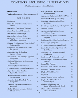
We can see from the contents that this 1947 book covers many composition topics of interest. Even though I have concentrated on his Informal Subdivision method, a review of the other principles he discusses would be helpful.
Loomis states that "Formal Subdivision was almost the only approach in earlier times, and great compositions have been built with it. It is largely the formality of design which lends such magnificence to the work of Michelangelo, Rubens and Raphael". He also stated that for the Illustration book he would not presume to analyze the masterpieces since they only know which design they used. Loomis uses only his own work in the book's illustrations. But he also emphasizes the importance of doing the examples yourself.
I would use some historic -or even contemporary- masterpieces as illustrations, especially ones that we know used some type of formal subdivision or dynamic symmetry. But we might find paintings that seem to illustrate the use of a grid even if not published as such. The artist might have had an innate sense of the grid while painting.
As an exercise for the reader it might be good to evaluate master paintings against formal 'grids'.
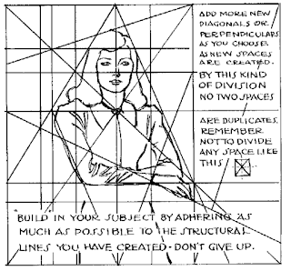
Loomis feels that "Informal Subdivision" is preferable in general to a Formal Subdivision or Dynamic Symmetry subdivision except for certain types of illustration or paintings that are in fact more formal in concept, UNLESS the artist is able to adapt the formal designs to be less formal: "Formal subdivision may also be used informally if one is adept enough". Note that the third 'grid' below has elements of the Harmonic Armature.
Contents:


