Design Armature Examples applied to the Santa Fe River Turbulence, a Golden Rectangle Painting
Notes:
- 9/15/25: Edited a bit. For example, the Wise Photo App Dynamic Symmetry Grid now works properly with a 2 to 3 proportion image (AR 1.5) since SLR cameras use this proportion.
- 5/15/23: Added "Golden Rectangle" to the title to emphasize that this post is about the golden PHI proportion. Added an image with the Rule of Thirds superimposed over a PHI grid for the viewer to see the difference visually. Removed comment about other proportions since they are not represented in this post. Removed the Wise Photo App version of the Dynamic Symmetry grid applied to this golden proportioned painting since it distorted the size in its downloaded version. In the App, it's best to use the PHI/Golden Triangle/Spiral 'grids' for golden rectangle proportions and the Dynamic Symmetry Grid for 3 to 4 or 2 to 3 formats. Note that other formats crop the images somewhat (or sometimes a lot) for the Dynamic Grid in this App. There is also a "rotate" mode avaiable. For this reason and others, most of the posts -aside from this- use 'made-in-house' grids with manual superposition via Photo Shop or Snap Seed. BUT the Wise Photo app is fun to use with its 14 different 'grids' including perspective lines.
- 4/19/23: Modified example grids for the rebated squares, using dotted lines to represent the rebated squares with diagonals. Added grid: pure dynamic symmetry. Added additional notes about the expanded dynamic symmetry grid. Added comment near the end about the vanishing point grid.
- 3/6/23: Added a Wise Photo App description for the Dynamic Symmetry example.
- 10/4/22: Emphasized technique by Bill Gallen on using a Golden Mean caliper while painting.
- 6/6/22: Added to the Informal Subdivision section: a grid with the SF River Painting
- 6/5/22: Added plain overlays for their improved visibility.
- 6/5/22: Expect some undisclosed typo and grammar corrections from time to time.
============================================
A Brief Presentation of Several Compositional Armatures:
- Rule of Thirds
- PHI Grid
- Golden Triangle
- Dynamic Symmetry
- Expanded Dynamic Symmetry
- Harmonic Armature
- Fibonacci Spiral
- Vanishing Point Grid
- Informal Subdivision
- Golden Mean "Caliper" System
Introduction
I wanted to analyze it further. Would it have been improved if I used another armature? I have constructed images with different armatures as overlays for my analysis. Perhaps my efforts will be of interest to you. You may also follow my progress on my website, www.karenhalbert.com, in the Exhibits section or eventually on its own page.
I used the Wise Photos' app for the PHI, Golden Triangle and Fibonacci Spiral Grids. To purchase: https://apps.apple.com/us/app/wise-photos/id1406085029 (it may be free now). One selects a photo (of a painting) for the app to provide grids as illustrated below. I like the simplicity and speed of using the Wise Photo phone app, especially when I am in the field. I intend to write a post on how to use this app in the field.
From time to time I add armatures obtained through my own constructions in Photoshop or from other packages -or combination thereof- including Tavis Leaf Glover's grid package: https://ipoxstudios.com/dynamic-symmetry-grids-for-photographers-and-painters/. I have also purchased his book, which has hundreds of grids and analyzed paintings and photographs at different aspect ratios: click here for the amazon link (though I can't believe I paid $46 for a kindle book- but I needed all significant references for this blog). I'm not a photographer but I found the examples on cinematography using a Root 6 cinematic grid format fascinating.
Observe that some of the Wise Photo app overlays work only with a golden rectangle with the sides in the golden ratio of approximately 1:1.618. Note that you may use the remaining grids including the Rule of Thirds and the Dynamic Symmetry grids for other proportions (with a caveat that only the 3x4 canvases are as accurate as they should be - more on this later).
I have been excited to analyze additional systems on this blog in more detail and will publish them soon. But I begin here with brief descriptions and examples. Coming later perhaps, will be a mathematical in-depth analysis.
Armatures
Rule of Thirds: Most artists use this rule - at least subconsciously. In general we have learned NOT to put the painting's focal point in the center of the paintings. A (mental) division of the canvas into thirds with horizontal and vertical lines helps avoid this. And it helps the painter begin his/her design to mark the 4 intersections of these lines to help identify one of these as a possible focal point.
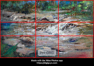
PHI Grid: an alternative to the Rule of Thirds. This option should be used with canvases of a particular ratio (namely a golden ratio) and this painting complies:
From the Wise Phone App:
"The Phi Grid is similar to the Rule of Thirds, but the horizontal and vertical lines are moved slightly inward to align with the Golden Ratio that is often seen in nature. This creates visual harmony that isn’t perfectly symmetrical with roughly 3/8ths of the frame in the upper part, 2/8ths in the middle, and 3/8ths at the bottom.
To apply this rule, place the main subject and supporting elements of your scene along a line or at a point where the lines intersect to create a dynamic focus for the viewer.
Because the intersecting lines are closer to the middle of the frame in the Phi Grid, the foreground can have more impact in the photo, and in some cases, like horizons, the Phi Grid can provide a more pleasing composition than the Rule of Thirds.
NOTE: The Phi Grid composition rule is based on the Fibonacci ratio of 1.618, which might not be the same ratio as your photo."
Golden Triangle Grid:
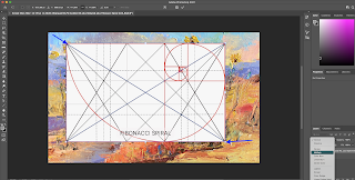
Dynamic Symmetry Armature:
From the Wise Photo App:
"When starting out with Dynamic Symmetry grids, it is easy to be confused by the numerous lines.." The app allows the user to rotate between the most basic grid of main diagonals only to a grid of diagonals plus reciprocals and then the grid with added horizontals and verticals.
Additional notes: The Dynamic Symmetry armature consists of the two main diagonals plus crossing lines (also known as reciprocal lines) from the corners through the main diagonals at right angles. (These crossing lines have played a significant role in historical painting design since they form a kind of opposition to main lines in the composition.) The intersections with the diagonals can be thought of as "Golden" Points, Points of Interest, "Polar Eyes" or just Focal Points, if desired. Verticals -and horizontals are drawn, passing through these points of interest. Points of intersection create energy.
Expanded Dynamic Symmetry Armature
Well known and excellent artist, Michele Byrne, uses an expanded Dynamic Symmetry Armature, with the process described here: OPA Article. Also watch her uTube video here explaining the grid steps in more detail (Please get in touch with me at karen.halbert@gmail.com if these links expire.). I have had the pleasure of watching her explanations in Zoom classes. This grid expands the Dynamic Symmetry grid to include rebated squares. Note the blue dotted lines here representing the rebated squares within this rectangle with its diagonals. This grid creates more diagonal lines to add dynamism to the composition.
Harmonic Armature: system described in detail on the website, http://www.the-art-of-composition.com/. The armature consists of 14 lines/diagonals that are constructed from the corners and the edge midpoints. Many artists are using this system and writing about it. (Google Harmonic Armature). This armature is an extension of the Rule of Thirds; the intersections of the main diagonals with the diagonals from the corners to the midpoints of the edges are at the 1/3 marks on the canvas. The other intersections of this grid are at other fractional divisions: 1/2, 1/4, 1/5, 1/6, etc.. For the proof, see my post, http://karenhalbert.blogspot.com/2022/04/trapezoids.html
Golden Spiral: use of the spiral as indicated in the first image, to identify the focal point and sweet spots along the spiral to lead the viewer's eye to the golden mean. This is in fact the system I used for this painting.

Santa Fe River Turbulence, with Spiral Overlay, 10x16.18
Example construction of an Informal Subdivision:
I have included here an Image of a page from the Loomis book, which I keep on my coffee table.
Available to the public:https://archive.org/details/andrew-loomis-creative-illustration/page/n29/mode/2up
(new pdf link: 12/30/2022).
Future Golden Mean Caliper Design: I've seen examples of dividing a canvas in grids at golden ratio distances from each other. The Phi Grid above is a simple case. I mean to try this for future paintings, as a stand alone; ie, create horizontals and verticals at golden mean distances from each other (but otherwise informally as with the Loomis method). Then add diagonal lines, since they add dynamism to a painting. I also picked up a technique from master artist, Bill Gallen, that I find useful, He uses a caliper to measure distances between points of interest, usually in the wash-in stage. Unequal measures are readily obtained in this manner.
Try to vary the distances so that any three points are at golden mean intervals (roughly estimated by the Fibonacci series (1,1,2,3,5,8,...): eg, a 16 inch wide painting could have (implied vertical) divisions at 3/8 and 5/8 of the 16 inch width or 6 and 10 approximately. The divisions here are symmetric and I would prefer they not be but this is to be discussed separately, since one division is 6 inches from the right edge. But this is just an example. These divisions could help ensure unequal measures and at divisions that some claim to be the most pleasing. (I was very excited when I saw this demonstrated by Bill, an excellent instructor).
It's more fun to use an actual caliper!! If I do create my own Armature technique, I will use a caliper when it's of use.
Also question to be analyzed: would the Dynamic Symmetry or the Harmonic Armature systems have yielded the same or better compositions?
How to incorporate the vanishing point in the grid? Perhaps begin with this "Vanishing Point" grid and add horizontal lines at golden mean distances from each other. Then drop verticals through the intersections of the horizontals and diagonals. I will try this for a non-golden proportioned painting when I do an in-depth post on the Wise Photo App.


