Workshop Exercises
This is an example of color mixing with paints, beginning with primaries, red, blue and yellow.


We will use this exercise as a basis for additional color mixing. For the two pastelists in the group, try to find pastel sticks that correspond with the colors on this color wheel. If you try to mix all the colors from 3 primaries (red, blue and yellow) , you might try using cross-hatching or appropriate blending to produce the secondaries and tertiaries (as indicated)..Or select 12 pastels that most correspond with these wheel colors.
In the following example I use these acrylic colors:
Modern Primary Triad: Hansa yellow (HY), Quinacridone Red (QR) and Phthalo Blue (PB) but choose whatever Y,R,B triad you want for this experiment/exercise.
Exercise. The goal is to mix 12 colors from 3 primaries, red, blue and yellow. First mix the primaries to get secondaries, violet, green and orange. Then mix these to get the indicated 'tertiarties'. So the net result is that you will have counter-clockwise around the wheel, starting from the top:
yellow (Y)
yellow-orange (Y-O)
orange (O)
red-orange (R-O)
red (R)
red-violet (R-V)
violet (V)
blue-violet (B-V)
blue (B)
blue-green (B-G)
green (G)
yellow-green (Y-G)
So, practice mixing any colors you have to see if you can reproduce these twelve colors, preferably beginning with three primaries. You might get some surprising and interesting results if you just begin with any version of yellow, red and blue.
Ignore the complements around the edge for this exercise (probably not helpful anyway; I put them there to juxtapose each color with its complement for my own benefit).
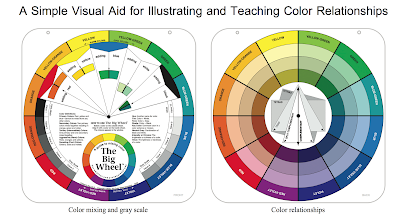
My color mixing is not perfect here. I have copied a version from the web for you to look at after this. (And you might leave a hole as was done in the web-image; it would be interesting to fill that area in with tints or shades or mixes t-o be discussed).
Note: the primaries have '1', the secondaries '2' and the tertiaries '3' above the name.

--
Second exercise:
Karen's Simplified Acrylics Color Wheel, perhaps considered a double primary color wheel: combinations of two primary triads:
Karen's Simplified Acrylics Color Wheel, perhaps considered a double primary color wheel: combinations of two primary triads:
Modern Primary Triad: Hansa yellow (HY), Quinacridone Red (QR) and Phthalo Blue (PB) (all transparent)
Impressionistic Primary triad: cad yellow medium (CY), cad red medium (CR), ultramarine blue (UB)
Note that these same colors are available in Oils and could be used. If I have time I will create the same wheel in oils. A first approximation could be done with one of the primary triads only as described in the email.

Paints used:
Utrecht Acrylics (but others okay):
Yellow:
Hansa yellow (HY), biased toward green/blue
Utrecht Acrylics (but others okay):
Yellow:
Hansa yellow (HY), biased toward green/blue
Cad yellow medium (CY), biased toward orange/red
Red:
Cad red medium (CR), biased toward yellow
Cad red medium (CR), biased toward yellow
Quinacridone red (QR), biased toward blue
Blue:
Ultramarine blue (UB), biased toward red
Ultramarine blue (UB), biased toward red
Phthalo blue (PB) biased toward yellow
Titanium White (large)
Alternatives: Cerulean blue for phthalo, Cobalt blue for Ultramarine blue, but more expensive.
Aliz. crimson (fugitive color; I'm trying to stay away from this favorite) or Napthol red for the Quinacridone red.
The 'primary' sectors have two hues each as noted. The mixes depend on the side of the color wheel.
Green = phthalo plus hansa yellow. Brighter green. For landscapes the ultramarine plus either yellow would yield more muted greens.
Purple = ultramarine blue plus quinacridone red. More chroma since this blue and red do not have yellow in them. Again for landscapes, cad red medium would yield more muted purple/grays.
Oranges are the Cadmium yellow medium plus Cad Red Medium. But Hansa Yellow plus Q.R. would also yield a nice orange, a little more muted since has a touch of blue.
Tips for creating the wheel:
Trace a large circle on a piece of canvas or use a protractor and place even marks around the circle, drawing lines through the center. It might have been better to use a black magic marker to delineate the sectors (pie shaped).
For acrylics keep the acrylics moist with spray so they do not dry out. Use a damp sponge underneath a disposable palette or a Masterson stay-wet system.
Use clean water and brushes at all times. But to be safe start with yellow mixes since the yellow can be so easily contaminated. I laid out the colors that would be used for the yellows and oranges first and painted the yellow/orange part of the wheel first. I wanted to make sure the paints remained moist. But with the sponge and the spray, the paints remained moist enough.
Keep the palette organized. It would be easier to keep the palette looking like the color wheel. I did not take a photo but for this simple color wheel, it might make sense to place the colors on the palette in a circle format.
Exercise: create your own 'black' mixture and construct a gray-scale based on it. "Black" mixtures are noted in Karen's Double Primary wheel above (mix until look 'pure' dark gray/black add a touch of white ON THE SIDE to see if the resulting gray would be neutral). These blacks could be used to create tones (mixed with white) or shades. To make the blacks try a ratio of yellow: red: blue 1:2:4.
Exercise: Construction of the Munsell Color Wheel with your own palette.
Exercise: simple image in the various harmonic schemes.
Exercise:. Use different color schemes for the same subject/scene.
Exercise: Analyze various paintings by master artists and/or artists who appeal to you. Check color schemes. Could the paintings be improved? Analyze your own paintings.
The Magic Palette
Exercise: Compare colors from the Color Wheel with the Magic Palette in the classroom.

The magic palette provides mixtures of many popular colors with each other (acrylics and oils but watercolor pigments could be compared; see list below). Note that the mixtures vary on the horizontal and vertical axes, with the vertical axis providing the dominant color-hue. In addition a small amount of white is added to each color (again varying from color to color and dominant axis to the other) to enhance the color. See explicit instructions on how the palette is created in this link:
Personal Mixing Guide: 18 Artist’s Paint Colours and Pigments Produces 324 mixed hues
• Cadmium Yellow Light (Py35)
• Cadmium Yellow Medium (Py37)
• Cadmium Orange (Po20)
• Cadmium Red Medium (Pr108)
• Quinacridone Red (Pv19)
Alizarin Crimson (Pr83)
• Magenta (Pr122)
• Dioxazine Purple (Pv23)
• Ultramarine Blue (Pb29)
• Phthalo Blue (Pb15:1)
• Cerulean Blue (Pb35)
• Phthalo Green (Pb36)
• Sap Green (Pb15,Py83)
• Perm. Green Light (Py74)
• Burnt Sienna (Pbr7)
• Raw Umber (Pbr7)
• Payne’s Grey (Pb29,Pbk11,Py42)
• Ivory Black (Pbk9)
• Titanium White (Pw6,Pw4)
Exercise: compare the color wheel (from The Color Wheel Company) colors with the magic palette.