Additional material
Last minute addition of a section from Bruce MacEvoy's website on the Painter's Six Paint Palette:
...... asserts a "color theory" comparison between material paints and ideal colors. In practice, theory doesn't matter. A painter is only concerned with practical criteria and color mixing facts to judge his working materials. So the modern painter modifies the traditional "primary" color criteria, and adds [five] more criteria, when selecting paints for a palette:
1. Does this paint significantly increase the maximum chroma or color variety in mixtures with other paints on the palette? In general, chroma has the greatest impact on expanding a palette gamut, and is therefore the most important color attribute of a "primary" paint.
2. Does this paint significantly extend the darkest values I can mix with this palette? It is usually preferable to obtain darker color mixtures by using primary paints at their darkest (most concentrated) value, rather than by darkening color mixtures with black.
3. Does this paint increase the variety of material paint effects I can produce with my palette? The material attributes of paints — transparency, staining, tinting strength, granulation, diffusion wet in wet, and so on — are as important as the color attributes.
4. Does this paint significantly increase my convenience and control when mixing colors? If you can reduce painting effort or improve color mixing accuracy by adding a paint to your palette, it is usually a good idea to add the paint.
5. Does this paint replace an undesirable paint that is not lightfast, does not contribute to the color contrast or color variety, is too expensive, or is too difficult to work with (including toxicity)? Many paints that are popular today are replacements for undesirable but popular paints of yesterday.
Paints that meet all five criteria are palette primary paints. "Primary" does not mean a paint corresponds to any kind of abstract color idea, however defined: it just means the paint is indispensible for color mixing in a given palette, when all the paint mixing attributes are taken into account.
Bruce also provides three guiding principles under his learning color through paint section:
- "Learn color with your eyes and hands rather than with your mind".
- "Each paint selection defines a unique mixing landscape".
- "Paint mixing is a form of improvisation".
A palette gamut is the collection of all unique colors that two or more of the palette primary paints can make if they are mixed in any combination, in any proportions — including any proportion of water (white paper) in the mixture.
 |
| gamut diagram of the six paint palette (without white and black) |
Because it is a factual description of the color mixtures produced by a specific color medium, we can draw a picture of a gamut (diagram). We place the palette primary paints in a circular order according to their respective hues, then we place each paint at a distance from a neutral or achromatic point (N) according to its chroma or saturation. (More saturated paints are located farther from the neutral gray — not at an equal distance from gray, as is commonly done in artist's "color wheels".) Paints with high chroma create a larger number of unique color mixtures with a neutral gray; light paints create a larger number of mixtures with black, and dark paints create a larger number of mixtures with white.
 |
| side view of the six paint gamut including white (W) and black (K)(inset) the gamut visualized as a color cube |
If we view the gamut from the side, so that we can also display the mixing lines between each primary paint and white and black, we can see the lightness differences among the palette paints (diagram, right). We discover that the irregular hexagon is actually a cross section of a double pyramid enclosure, with two peaks at white and black. Some paints (yellow, orange) are closer to white, and others (cyan, violet) are closer to black. The interior diagonal from white to black defines the artist's value scale or grayscale. (To minimize confusion, it is helpful to visualize this gamut as a cube, with the six palette primaries, white and black at each corner [inset, right].)
More on The Munsell Color space:
Golden has a page devoted to the Munsell coordinates of its heavy body acrylic colors: http://www.goldenpaints.com/technicalinfo_munsell
The Munsell Color Tree is a three-dimensional model that helps visually explain the Munsell system. It features 309 colors mounted on clear panels and assembled on a base. This allows you to spin the tree and see the relationships between the colors. (I will have a copy of the Student's Guide to the Munsell System in class, with some color chips).
Color Tree:

Each color has 3 dimensions or attributes, Hue (H), Value (V) and Chroma (C). Hue is assigned a number and letter(s) which represents the color. Value and Chroma are assigned numbers. This is referred to as the Munsell notation.
For example, 5PB 5/1 would be:
- Hue: 5 Purple-Blue
- Value: 5
- Chroma: 1
Comparison of the Munsell and Primary Hue Circles:

Munsell theory is based on 5 'primary' hues: yellow, red, purple, blue and green with 5 hyphenated intermediate hues.
 |
| 20 hues of the Munsell color system, at varying values and maximum chroma |
Example page from the "Munsell Book of Colors":

The highest chroma for this (mid hue) purple-blue is of lower value than the highest chroma for this (mid hue) yellow, its complement in the Munsell system.
Interesting point from www.handprint.com: "The Munsell system represents the range of colors that can be achieved by high quality acrylic paints, or inks printed on highly reflective white paper; the range of colors possible with watercolor pigments is significantly smaller." (bold added by me)
==================================================
And more....
Excerpts from the excellent website by David Briggs: www.huevaluechroma.com:Detailed examples of the history of Color Theories can be found in the Briggs' Color Wheel blog: http://www.huevaluechroma.com/001.php. and http://www.huevaluechroma.com/071.php
Briggs describes in detail theories form Aristotle to Newton and on to Goethe, Munsell and others. My apologies for copying these here rather than constructing a parallel explanation. However, this is so well done that it's worth reading. Note that this is found under two of his sub-sections: From Aristotle to Newton and http://www.huevaluechroma.com/072.php
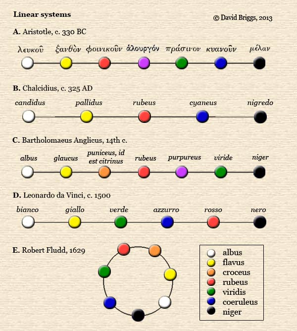
Figure 7.1.2. Linear colour order systems. A. Aristotle, c. 330 BC, Peri Aistheseos kai aistheton. B. Chalcidius, c. 325 AD, from his commentary on Plato's Timaeus,. C. Bartholomaeus Anglicus, c.1245, from his encyclopaedia De rerum naturalis (Of natural things). D. Leonardo da Vinci,c. 1500, Trattato della pittura. E. Robert Fludd, 1629, Medicina Catholica. All diagrams based on purely verbal descriptions, except E (after Fig. 7.1.1D). For details of the original publications see Kuehni and Schwartz (2008, pp. 31-33, 37-38).
Multilinear systems, a compound system, Newton's Hue system as a circle, etcetera.
"It is difficult to overstate the importance of Newton's discoveries, which contributed directly or indirectly to a huge part of our conceptual framework of colour in science, technology and art - not to mention the discovery of radio waves, microwaves, and the rest of the electromagnetic spectrum! Once hue and saturation had been added to brightness as independent dimensions, it was only a small step (first taken by Brook Taylor in 1719) to recommend an explicitly three-dimensional conception of colour. The hue circle and the concept of complementarity were particularly important developments for artists, and even the concept of "warm" and "cool" hues does not seem to have taken hold until after artists saw their hues laid out in a circle."
Origins of the "artists' colour wheel"
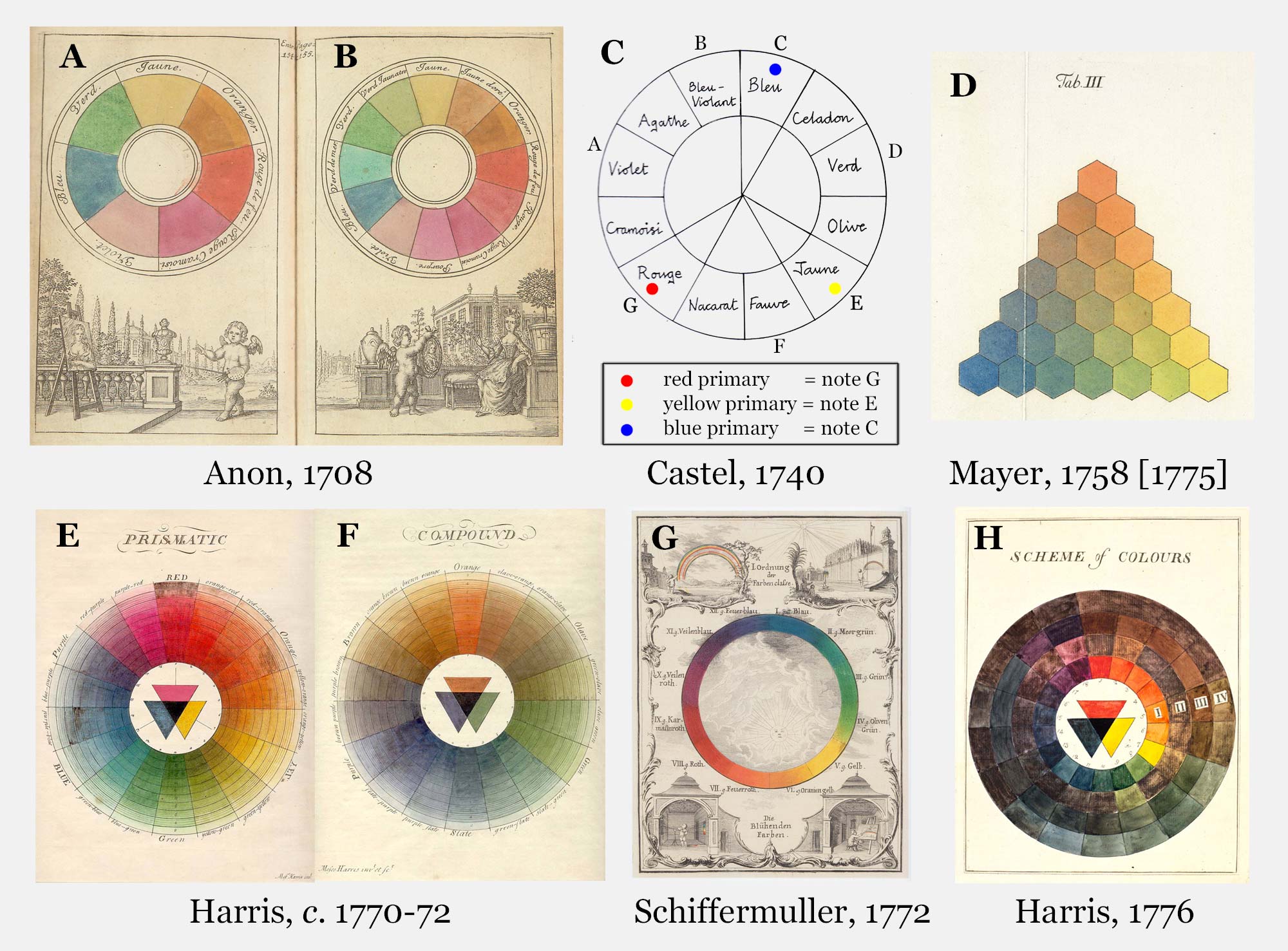
Figure 7.2.1. Eighteenth century hue sytems (click to enlarge). A, B, Hand-painted colour circles from the 1708 edition of the Traite de la peinture in mignature. C, Louis-Bertrand Castel, 1740, L'Optique des couleurs, as illustrated by Kemp, 1990. D, Tobias Mayer, 1758, De affinitate colorum commentatio, as illustrated by Georg Christoph Lichtenberg in 1775. E, F, Moses Harris, c. 1770-72, The natural system of colours. G, Ignaz Schiffermuller, 1772, Versuch eines Farbensystems. H. Moses Harris, 1776, Exposition of English insects [1782 edn]. For details of these publications see Kuehni and Schwarz (2008).
"This twelve-hue circle [in 2.1.2.A] is the earliest example of the so-called "artists' colour wheel", an arrangement of regularly spaced hue divisions structured around the three historical primaries. "
After Newton introduced the circular dimension of hue in his Opticks of 1704, it was only a small step to arrange the three hues of the seventeenth century artists' linear scale around a circle.
Concise description of the dimensions of color, hue, value and chroma with illustrations in Munsell Space: The dimensions of color introduced by D. Briggs. This includes a look at modern spaces.
Concise description of the dimensions of color, hue, value and chroma with illustrations in Munsell Space: The dimensions of color introduced by D. Briggs. This includes a look at modern spaces.
Goethe: (From handprint.com. "But there is a more important issue. When Goethe's book is read as a whole, the intellectual "debate" between Newtonian color science and Goethean color poetry remarkably foreshadows the contest between evolution and Creationism (aka "Intelligent Design") — and with uncanny parallels in the details. The same rhetorical tactics used today by Creationists against evolutionary biology (ignoring or misconstruing evidence, selective citation, reasoning from false premises, fabricating explanations to suit preconceptions, "what if" counterarguments, and hostile ad hominem rhetoric) were used by the Cartesians and by Goethe against Newtonian physics. The same spiritual accusations made today by the Creationists against evolution or cosmology more generally (that it is imaginary, that it is "only a theory", that it is soulless, that it ignores the evidence of our senses, that we can't actually "see it" happen) were made by Castel and Goethe against Newton's "ghostly" refrangibilities."
"Also. In sum, this book about color by a man who was neither an artist nor a scientist offers neither practical artistic guidance nor a valid scientific approach to color. It offers instead a fascinating case study of error and falsehood. Oblivious to the grossly censored and misinterpreted transmission of Goethe's true gospel, many authors today still treat him as the quotable old testament of "color theory" in what has become a ritual display of color erudition. As I've taken pains to show, ritual is never erudition enough."
===========================
More from the Gamblin site:
Modern <---> Impressionistic (note by Gamblin):
The biggest difference in the characteristics between mineral and modern colors–and arguably of most interest to painters–is how these two groups of pigments behave differently in color mixing. Below are two different reds, the mineral Cadmium Red Medium and modern Napthol Red, each mixed with Titanium Zinc White.

As shown above, the mineral Cadmium Red Medium "greys down" and loses its intensity as it is mixed with white, compared to the modern Napthol Red, which retains its intensity in its tint. This difference will hold up for any mineral vs. any modern color. Mineral colors, in tints, shift in VALUE and CHROMA. Modern colors shift only in VALUE and retain their high CHROMA. This difference will also hold up during color-to-color mixing:

Mineral colors are suitable for painters that are interested in capturing the colors of the natural world and the effects of natural light. Modern organic colors are appropriate for painters who want to make high key color mixtures. Modern colors are also more transparent, giving painters high key colors in all hue families for glazing or indirect painting techniques.
Tour of the color wheel from MacEvoy's www.handprint.com:
MacEvoy lists 12 popular artists' watercolors and describes each in detail. The description is of interest to acrylic and oil painters as well since it lists the colors by pigments: http://www.handprint.com/HP/WCL/color16.html#whydifference
Rules for mixing complements from MacEvoy's www.handprint.com:
This comparison of visual and mixing wheels leaves us with these three rules for mixing complements:
(1) You can ignore the yellow paints from cadmium lemon up to hansa yellow deep; they are not effective mixing complements with any cool pigment.
(2) All blues, from ultramarine violet BS to cobalt teal blue, form mixing complements with paints from hansa yellow deep to middle red, indicated by lines converging on the blue circle. In general, dull (low chroma) warm pigments, such as quinacridone maroon or raw umber, are more effective neutralizing paints than very intense pigments.
(3) All greens, from phthalo green BS to sap green, form mixing complements with paints from deep red to violet, indicated by lines passing through the green circle; the yellow greens can all be neutralized with dioxazine violet.
The simplest way to remember the mixing complementary relationships in the paints you use is just to memorize the best neutralizing pigment for each blue or green pigment from the table of mixing complements. The blue and green circles can help you to find the most likely mixing complements for any cool mixture, if you can identify the location of the mixture on the artist's color wheel (or the existing blue paint it most resembles).
(my note: the pigment names should give a clue to the mixing complements of oil and acrylic paints, if you know the pigments. For example, ultramarine blue has quinacridone orange as one of its mixing complements (mixture tends toward gray).
| ||||||||||||||||||||||||||||||||||||||||||||||||||||||||||||||||||||||||||||||||||||||||||||||||||


Tour of the Color Wheel (12 colors, where cyan, magenta and light yellow are primaries):
1 : LIGHT YELLOW (primary) : This hue is a tangy, bright yellow, the color of lemons and canaries, which often takes on a distinct greenish appearance, especially at darker values. For most viewers it matches a monospectral hue of around 575nm. The visual color wheel locates hansa yellow light (PY3), cadmium lemon (PY35) and the benzimidazolone yellows (PY151, PY154, or PY175) at the "primary" yellow point. Artists differ in how much green they prefer in this hue; the Munsell color circle picks a very lemony yellow as the exemplar. My own preference is for hansa yellow (PY97) because it is very lightfast, intense, and has a hue that contains (to my eye) no hint of orange or green. The historical pigment aureolin (PY40, not shown because it is impermanent) is a slightly cooler and less intense yellow, while bismuth yellow (PY184) is whiter and therefore less intense than the usual cadmium lemon. Copper azomethine or green gold (PY117) and nickel titanate (PY53) are relatively dull light yellows and therefore less suitable as a primary mixing paint; all have a distinct green or greenish gray color. All yellows at this color point quickly lose their characteristic yellow appearance as they are darkened or made less intense, turning rapidly into a dull warm green and then into a peculiarly lifeless gray. Note that none of these yellows can be used in neutralizing mixtures with blue violet; they all make dull greens.
2 : DEEP YELLOW (tertiary) : This is the golden color of highway caution signs, school buses and autumn squash. It corresponds to a monospectral hue at around 595nm. The visual wheel places hansa yellow deep (PY65), cadmium yellow deep (PY35) and nickel dioxine yellow (PY153) at this location, but many cadmium paints labeled yellow orange or yellow medium are also close to this hue. (The Munsell Book of Color chooses a color slightly warmer than cadmium yellow deep for this hue location.) A less intense but very lovely alternative is quinacridone deep gold (PO49). This second hue point is interesting for several reasons. Mixing the hue from yellow and red produces a duller mixture than expected, often duller than a red orange mixed from the same paints. This is also the yellowest hue that can neutralize mixtures with blue violet; mixing complements for cool colors really start at this hue point and continue through purple. Finally, this is the hue point at which the yellowest earth pigments are located — the many "yellow" iron oxide pigments (PY42 or PY43, marketed as raw sienna, yellow ochre, mars yellow or gold ochre). If this hue is made even less intense, it turns into a grayish or grayish brown hue, typical of raw umber (PBr7). A handy way to remember the yellow range of the spectrum is to remember that most "medium" cadmium yellows are about half the distance from cadmium yellow deep to hansa yellow light, and hansa yellow medium (PY97) is about half the distance from cadmium medium to hansa yellow light.
3 : RED ORANGE (secondary) : This is an especially intense and powerful hue, just at the boundary between scarlet and orange (hues on either side of this hue point). It corresponds to a monospectral hue at around 630nm. The best exemplars of this color are pyrrole orange (PO73)or the slightly warmer cadmium scarlet (PR108) or cadmium red orange (PR108). The less intense pigments in this color category include the "red" iron oxide pigments (including venetian red, indian red and light red, all PR101) and the synthetic organic equivalent quinacridone maroon (PR206; Daniel Smith's quinacridone burnt scarlet and Winsor & Newton's brown madder). It's also important to familiarize yourself with the pigments that fall between the deep yellow and red orange color points: cadmium orange (PO20) and benzimidazolone orange (PO62) are the most intense, while among the duller but very useful paints are quinacridone gold (PO48) and the extremely useful burnt sienna (PBr7), a moderately dull, orange iron oxide pigment that is a mixing keystone in the "warm" color range. Even darker and less intense is burnt umber (PBr7), which can be used in place of burnt sienna in any mixture that you want to take to a darker and duller color (although it is oddly ineffective at mixing true grays with most blue paints). Naphthol scarlet (PR188) and pyrrole scarlet (PR255) are very intense pigments on the red side of this color point. It's interesting that artists tend to have a distinctive preference in warm paints: some (Caravaggio, Turner, Gauguin, Matisse) seem to like red orange focal hues, while others (Van Gogh, Rubens, Rembrandt) seem to prefer a deep yellow.
4 : MIDDLE RED (tertiary) : This is close to a "pure" red that leans neither toward orange nor violet. Its closest monochromatic counterpart is extraspectral, matched with a mixture of 90% extreme "red" wavelengths (around 700nm) and about 10% violet light. The visual color wheel places quinacridone magenta (PR122) or quinacridone violet (PV19) at this location. (It's remarkable that the entire color span from middle red to red violet, formerly represented by a shoddy gang of fugitive organic pigments, has been handsomely replaced by different shades of a single modern and lightfast pigment: quinacridone.) Notice that cadmium red medium (PR108) or pyrrole red (PR254) correspond to the average conception of unique red or a pure "red" spectral hue, and that the range from scarlet to deep red is visually quite small — about the same as the distance between the yellow and green shades of phthalo green. And there is quite a crowd of "warm red" pigment alternatives between the red orange and middle red points on the wheel. These include the cadmium reds (PR108), naphthol reds (PR112 and PR170), quinacridone reds (PR209 and PV19), perylene scarlet (PR149), perylene red (PR178), perylene maroon (PR179). Notice that in the visual color wheel the red and yellow spans of the spectrum are approximately the same size: deep yellow is the middle boundary between the two. Most of these reds mix strong blacks with phthalo green BS (PG7), and strong dark grays with cobalt turquoise or teal blue. I find it useful to divide the warm colors in two groups — the paints that can or cannot mix a green color with a greenish blue paint such as phthalo cyan or phthalo blue GS. Yellows up to cadmium yellow deep can, and reds down to benzimidazolone orange cannot.
5 : MAGENTA (primary) : This is a distinctive bright, bluish red hue that is easy to recognize once you've seen it. It corresponds to the hue that J.W. von Goethecalled purpur, a term that is mistranslated as "red" or "bright red" in the English edition of his Farbenlehre. It has no monospectral counterpart, but must obtained by mixing roughly equal parts of "red" and "blue violet" wavelengths. Unfortunately pigments with this hue are darker and/or less saturated than the spectral light mixture, giving paints at this locating a relatively purplish or pale color. An excellent choice for this point is cobalt violet (PV49); the only other pigment alterative is manganese (mineral) violet (PV16), though it is too blue and too dull to make useful mixtures with the warm pigments. (I don't consider the hues from quinacridone magenta to ultramarine blue, and the complements from phthalo green YS to cadmium lemon, to be either warm or cool.) Some "accomplished" artists continue to use the fugitive magenta and carmine pigments, including alizarin crimson and rose madder genuine. But apparently they do so with a furtive conscience: posing as an interested buyer, I've found that a few don't notify their collectors of the lightfastness issues related to their choice of paints.
6 : PURPLE (tertiary) : A relatively rare hue encountered most often in certain flowers or gems. It has no spectral counterpart, but is obtained by mixing "violet" (400nm) wavelengths with a very small amount of "red" light. This location is represented by either dioxazine violet (PV23), the red shade of ultramarine violet (PV15), or cobalt violet deep (PV14). Few artists use these mineral purple pigments because they have poor tinting strength, are not especially bright, and are strongly granulating; many avoid dioxazine violet because it tends to fade in some watercolor paint brands. To avoid these problems many paint brands offer the color as a purple convenience mixture of a rose or magenta quinacridone and ultramarine blue. Points 5 through 7 of the wheel are also confusing to learn because the apparent hue of a paint depends on its lightness and/or chroma: magenta paints appear to redden with increased chroma, and blue violet paints appear to shift toward purple. This is especially noticeable in quinacridone violet (PV19), which has the same spectrophotometric hue as quinacridone magenta (PR122), but appears distinctly bluer because the color is darker and less intense. A similar hue difference appears between indanthrone blue (PB60) and ultramarine blue (PB29).
7 : BLUE VIOLET (secondary) : Here we enter the blue hues, corresponding to a monospectral hue at around 440nm. The "blue" shade of ultramarine violet (PV15) and the mystically dark indanthrone blue (PB60) are the best pigment representatives for this hue and the visual complements for "primary" yellows at point 1. The very popular pigment ultramarine blue (PB29) is placed between points 7 and 8, where it is the visual complement of a middle yellow to deep yellow hue). The nearness of ultramarine blue to a violet color is revealed by the fact that the blue shade of ultramarine violet (PV15) is very close by.
8 : MIDDLE BLUE (tertiary) : This point approximately corresponds to the average conception of "unique" blue or "pure" blue. It corresponds to a monospectral hue at around 465nm. The few pigment exemplars at this point include cobalt blue (PB28), phthalo blue (PB15) and iron [prussian] blue (PB27). The visual wheel also locates the warm shades of cerulean blue (PB35) or the green shade of phthalo blue (PB15:3) approximately at this color point. Pay special attention to brand variations in color when selecting paints around points 8 and 9 on the color wheel. Mixing complements for the blues at point 8 are typically deep yellow and middle orange, and their dull "earth" equivalents such as raw sienna or gold ochre.
9 : CYAN (primary) : This is a bright, light greenish blue, also unmistakable once learned, representing the "primary" cyan in paint mixing. It corresponds to a monospectral hue at around 480nm, which is close to the wavelength of maximum transmission (and therefore the color) of water ice (though most landscape water contains suspended matter that shifts the color toward green or brown). For this hue there is one good pigment choice — phthalo turquoise (PB16) — although a very green phthalo blue (PB15:3) or the discontinued phthalo cyan (PB17) also serve well, in paints and in printing inks. Manganese blue (PB33) is more granular but also a good hue substitute, as are cobalt turquoise or the greener shades of cerulean blue (PB36) and cobalt teal blue (PG50). The mixing complements for all these paints are typically a red orange or scarlet hue, especially in the dull "earth" colors.
10 : BLUE GREEN (tertiary) : This hue is a lovely dark green with just a hint of blue, and corresponds to a monospectral hue at around 495nm. The visual color wheel places the dark and intense phthalo green blue shade (PG7) and the lighter and less saturated viridian (PG18) and cobalt titanate blue shade (PG50) at this location. The mixing complements for this point are usually middle or deep red, and the fact that red and blue green are such antagonistic colors in color vision (lying at opposite ends of the r/g opponent contrast) means that many of these neutral mixtures are especially dark and rich.
11 : GREEN (secondary) : This green corresponds to a monospectral hue at around 515nm. The visual color wheel puts phthalo green yellow shade (PG36) and the much duller and more opaque chromium oxide green (PG17) close to this point. Winsor & Newton used to market a yellow version of cobalt titanate green (now discontinued, PG50) at this hue. All the rest of green paints at this and the next point are convenience greens that vary widely in transparency, saturation and lightfastness. (The pros and cons of these and other green pigments are dished up in the page on mixing green.)
12 : YELLOW GREEN (tertiary) : To close out the color wheel, there is a long slog of green and more green until we come back to cadmium lemon. This yellow green corresponds to a monospectral hue at around 555nm — which is the chromaticity of our peak daylight sensitivity. Despite its sun bright character, yellow green is an unpopular color in everything from clothing to cars to home decor, and there are no pigments available to provide it: the vivid greens, leaf greens and yellow greens marketed in this hue are all convenience mixtures of phthalo green (usually PG36) and a bright yellow. I find sap green (listed as a convenience mixture under PG36) is more convenient to use, and it is also an excellent mixing and visual complement for dioxazine violet. Note that the perceptual difference indicated the visual color wheel between phthalocyanine green PG7 and cadmium lemon is almost exactly the same as that between quinacridone magenta and ultramarine violet. And the mixing complements for all these yellow green colors are the purple colors directly opposite on the visual color wheel.
At first reading, this survey of the color wheel seems to cover a confusingly large number of pigments and colors. The differences between scarlet and brown, or yellow and ochre paints — what I call the unsaturated color zones— also complicate color judgments on the "warm" side of the color wheel.
But don't despair. The simple exercise of mixing paint wheels is a great way to learn these color variations and the major color differences that result from mixtures of paints from any two color points.