(extra) Color Palette Examples
====================================
====================================
String Palette:
I would like to include some material here on the palette of strings based on the Munsell theory, that formed my very first palette for oil painting. My instructor was the artist, Keith Gunderson, www.classicrealism.com, whose palette is based on the use of 'value' strings. Variations were used at the Art Student League in NYC by the highly regarded instructors, his teacher, Frank Mason and O'Reilly. I have purchased a book by a student of O'Reilly to be available during the workshop with examples from his class notes! One of my current mentors in Santa Fe, Doug Higgins, was a student of and monitor for Mr. O'Reilly and has written a book also on his experiences with Mr. O'Reilly. Doug is writing a new book on Landscape painting that has a section on Color, which we might be able to use as a reference also.
====================================
 |
| Example Frank Reilly Palette (link to interesting notes on color mixing) |
Note: I am mentioning here the Gunderson palette, as an example of my palette arrangement from my first instructor. His palette was based on artists' palettes from the past, including Frank Reilly.
 |
Keith Gunderson Palette (link to materials' list)
|
Emile Gruppe's Palette: from Keith Gunderson's website. This is an example of the double-primary (or split primary) palette, with a "warm" and "cool" of each of the R, Y and B primaries (plus orange as a convenience color).
 |
| Emile Gruppe's Palette |
===========================================================
 |
| Doug Higgins (Santa Fe artist) |
Note: Doug Higgins was a student of Reilly and his classroom monitor.
============================================================
And a beautiful example of a palette (for portraits):

And finally, a current mentor, Albert Handell:
 |
| Albert Handell Studio Palette (Santa Fe Artist) |
And a beautiful example of a palette (for portraits):

A study I did a few years ago with a limited palette, with chromatic black as a substitute for ivory black. Chromatic black is a mix of violet and phthalo green. For an in-depth description by Gamblin of this oil paint color see: http://www.gamblincolors.com/newsletters/studionotes16.html
The reference has notes on mixing with the usual ivory black/titanium white grays or with complements.

Karen Halbert Limited Palette
How could this painting be improved?
 |
| Karen Halbert Limited Palette |
How could this painting be improved?
From The Dimension of Color website by David Briggs: http://www.huevaluechroma.com/109.php
A more efficient approach is to systematically pre-mix "strings" of colour mixtures in order to have available an array of pools of colours that can be used to draw a mixture through colour space in any required direction. A simple and popular approach is to add white progressively to each pigment (Figure 10.16). A more methodical version of this approach involves controlling the precise lightness of each of these steps, often in reference to the Munsell tonal scale.
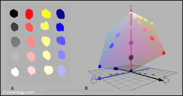
Figure 10.16. Simple example of a palette arrangement created by adding white progressively to black and several coloured pigments. Any required colour can by mixed from one or two coloured pools, adjusted for lightness and chroma using a grey pool.
My own preference is a variation on the set palette idea in which colours are mixed along shading series (Figure 10.17). This makes the mixing of the shading progressions needed in a tonal painting a lot more efficient. Intermediate colours can be cross-mixed from these pools, and additional shading series can be added for important coloured surfaces in the picture if needed. Mixing such a palette takes more time than the adding-white type, but once mixed the palette permits very fast and fresh painting.
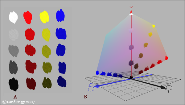
Figure 10.17. Simple example of palette arrangement created by mixing shading series from several pigments. Any required colour can by cross-mixed from one or two coloured pools and neutralized as needed using a grey pool.
==========================================================
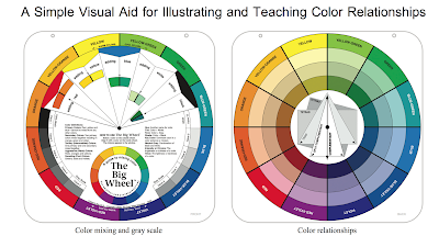
We used a color bias method for the double primary palette. This is another way to look at it:
If you want to mix a relatively saturated ('clean') green, you look at the outer rim of the color wheel, and choose your two starting colors that 'lean towards', or are closer to, the color you want to mix - green. So in the illustration below, you can see that if you mix a greenish yellow (like Lemon Yellow) with a greenish-blue (like Cerulean Blue or Phthalo Blue), you'll get a relatively saturated range of greens. You can vary the hue by varying the proportions; less blue and more yellow will give a more yellowish green, and less yellow more blue will give a more blueish green...a turquoise.
If you want to mix a desaturated (greyed) green, you choose your two starting colors that are farther apart from green along the outside edge of the color wheel. So an orangy-yellow (like Cadmium Yellow Deep, Hansa Yellow Deep, or even a greyed orange-yellow like Yellow Ochre), and mix it with a purplish blue (like Ultramarine Blue). And again, you can vary the proportions to get the hue you want; either more towards yellow or more towards turqoise, but the range of greens you get is greyer.
You could also use two starting colors where one of the colors leans towards the color you want, and the other leans away from it. So you could mix the orangy-yellow with a greenish blue. Or the lemony-yellow with the purplish-blue. The illustration doesn't show the results of these two mixes. As always, vary the proportions to get the hue you want (to make it more yellowish or more turquoise-ish). This should give a range of greens less saturated than if you choose two starting colors that are closer to green along the rim of the color wheel, but more saturated than if you choose both starting colors that 'lean away' from the green. It's a compromise. And these two combinations will give a very different range of greens...it's best to do some mixing swatches and see this difference for yourself, in whatever medium you choose.
If you want the most saturated green possible, even more saturated than you get by mixing the greenish-yellow with the greenish-blue, then you might have to just use a tube of Phthalo Green or Viridian. This is represented by the green on the outside edge of the color wheel.
Two more practical examples: You can mix a beautiful, dark, blackish-blue by mixing a green with a purple. You can even mix a dark, dull yellow by mixing two colors that are adjacent yellow. As always, varying the spacing of your starting colors will help to determine how desaturated your resultant color will be. If you want to mix a greyed color, and you don't have the color(s) you need in order to mix it using this method, you can often pre-mix one or both of your starting colors yourself.
=====================================
Wilcox: Blue and Yellow don't make Green: Two uTube videos on the Wilcox double primary (color bias) technique, on background of the color wheel, with historical examples of the use of pigments and binders (including egg yolks or whites) from cave and fresco paintings with no color mixing and early paintings. Interesting side bit: since the original ultramarine or vermillions were so expensive, artists didn't mix them. The invention of oil colors was a major breakthrough; colors could be mixed on the palette and on the surface. Students spent 15 years studying under masters, making paints to begin with. Color mixing was under control from much experience. But as more people began to paint, mud was often the result of mixing colors. Color wheels were developed to try to help understand how colors mixed. Second uTube describes the Wilcox color wheel.
We used a color bias method for the double primary palette. This is another way to look at it:
If you want to mix a relatively saturated ('clean') green, you look at the outer rim of the color wheel, and choose your two starting colors that 'lean towards', or are closer to, the color you want to mix - green. So in the illustration below, you can see that if you mix a greenish yellow (like Lemon Yellow) with a greenish-blue (like Cerulean Blue or Phthalo Blue), you'll get a relatively saturated range of greens. You can vary the hue by varying the proportions; less blue and more yellow will give a more yellowish green, and less yellow more blue will give a more blueish green...a turquoise.
If you want to mix a desaturated (greyed) green, you choose your two starting colors that are farther apart from green along the outside edge of the color wheel. So an orangy-yellow (like Cadmium Yellow Deep, Hansa Yellow Deep, or even a greyed orange-yellow like Yellow Ochre), and mix it with a purplish blue (like Ultramarine Blue). And again, you can vary the proportions to get the hue you want; either more towards yellow or more towards turqoise, but the range of greens you get is greyer.
You could also use two starting colors where one of the colors leans towards the color you want, and the other leans away from it. So you could mix the orangy-yellow with a greenish blue. Or the lemony-yellow with the purplish-blue. The illustration doesn't show the results of these two mixes. As always, vary the proportions to get the hue you want (to make it more yellowish or more turquoise-ish). This should give a range of greens less saturated than if you choose two starting colors that are closer to green along the rim of the color wheel, but more saturated than if you choose both starting colors that 'lean away' from the green. It's a compromise. And these two combinations will give a very different range of greens...it's best to do some mixing swatches and see this difference for yourself, in whatever medium you choose.
If you want the most saturated green possible, even more saturated than you get by mixing the greenish-yellow with the greenish-blue, then you might have to just use a tube of Phthalo Green or Viridian. This is represented by the green on the outside edge of the color wheel.
Two more practical examples: You can mix a beautiful, dark, blackish-blue by mixing a green with a purple. You can even mix a dark, dull yellow by mixing two colors that are adjacent yellow. As always, varying the spacing of your starting colors will help to determine how desaturated your resultant color will be. If you want to mix a greyed color, and you don't have the color(s) you need in order to mix it using this method, you can often pre-mix one or both of your starting colors yourself.
"Real-life" sample palettes from the wet canvas.com: http://www.wetcanvas.com/forums/showthread.php?t=2494
This forum has contributions from many different artists. Well worth perusing.