Turbulence Series: Hillsides
Documentation of the development of a larger scale painting of Turbulent Hillsides in the High Desert of New Mexico.
I have been painting a series of works titled High Desert Colors. They use the prismatic colors seen here in the high desert, perhaps pushed to emphasize the full color palette. Several paintings are currently (Dec 2020) in the Marigold Arts Gallery on Canyon Road in Santa Fe, NM. They can also be seen on my website, www.karenhalbert.com. The very first in the series (I: sold) was inspired by a painting by Lois Griffel in her excellent Impressionist Landscapes' book, based roughly on her Sunny Day Marsh (with the water removed).
Some of the inspiration came from paintings by Erin Hanson, Open Impressionist (https://www.erinhanson.com/), Her use of exaggerated color, bold mosaic of patterns and thick brushwork is very attractive to me. Her colors are built from a limited palette of red, blue and yellow. I have experimented with such a palette and do find it leads to more harmonious paintings. She mixes shades and tints from this limited palette before she begins applying paint to the canvas. I tried to use a more expanded palette, preferring to see a full spectrum of colors from the tubes. Then I also mix an even more expanded array of shades and tints, aiming toward the final colors that will be applied to the canvas. Hanson does tone her canvas loosely with thinner colors, which I also do.
I will use my palette knives to apply the final paint however. But in addition, I like to put in blocks of color and modify them appropriately.
Other first steps that I will take will be to construct:
- Decide on a scene to paint, either outside or from your own photo refeces. You might want to use a few photos that represent the scene. Then decide on what you want to include in the painting. I might use photoshop to create the scene.
- preliminary 4x6 value study with 4 shades of warm gray markers with a thrust map consisting of main vertical, horizontal and diagonal lines meeting at the focal point. (Reference: Michelle Byrne)
- informal subdivision (Reference: Andrew Loomis) plan on a small 9x12 or 8x10 canvas overlaying the thrust map
- warm and cool transparent thin painting of whole scene on this smaller canvas (using ultramarine blue and burnt sienna or transparent red oxide perhaps to represent the values properly. The warmer colors toward the front will have more of the burnt sienna. In this thin layer the paint strokes are quite vigorous, scrubbing the paint so that it is thin and will dry fast (reference: Albert Handell).
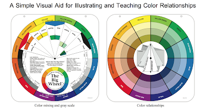
- construction of the full palette and range of prismatic colors to be used for the colors seen in this high desert country (using a double prmary palette from six colors of warm and cool of each primary). At this point iI will avoid using the yellow ochre and transparent red oxide, rather mixing them from my double primary limited palette. I might add phthalo green to the palette in order to capture a full dark or deep green that is difficult to obtain from blue and yellow. Double-primary references: Many throughout the industry. Just google Color Wheel or Primary Palette. Personal references: Keith Gunderson, my first oil painting teacher. He taught us the use of a palette of "Strings" of color tints and tones. Recently I read another reference to this palette taught at the Art Students League. Both Frank Mason and Vincent Dumont used this type of palette. I even have a box palette with plastic trays to hold the strings. I loved using this paint box but the paints dry out too fast for me. Now I use a large, glassed palette with the colors arranged around the edge prismatically. The middle is used for mixing.
- Possible double primary palette (all Cobra water based oils): cadmium yellow lemon, cadmium yellow medium , vermillion (substitute for either cad orange or cad red light), madder lake (alizarin substitute), ultramarine blue and cerulean blue phthalo. Preliminary step is to create a quick color chart of these pigment/colors. Can I achieve a deep enough purple for the landscape? Can a rich enough green be created from these? I will check my current color charts and make a decision and then show the final result here. Google Double Primary Palette.
- Color block first pass on another 8x10 (9x12) panel. These colors will be primarily pure from the double palette. Some area blocks will be somewhat lighter versions of these purer usually darker areas. But in general this phase will look very abstract with pure colors that indicate the overall pattern. In addition though the first layer of colors consists typically in the complement of the final colors in general. (Reference: Master Signature Artist of the National Impressionism Society, Lois Griffel, an artist friend in Green Valley, Az.) I studied with her during the winter of 2019-20 before the pandemic. I love her use of prismatic colors but she also is very mindful of values and interprets colors according to their values as she paints.
- The block is modified for the next phase. In contrast to Hanson, I will use the techniques of modifying areas of the color blocks, stepping up or down from the prism of colors. This should mean i don't have to mix every single shade on the palette. Some mixing is done directly on the canvas. This is how I have been painting. For example then, I might take a pre-mixed orange and paint a whole block with this. Then I might take the yellow that was used in this orange and brush some on top of part of the block. Or I might lighten the yellow a bit before I do this. But I apply the second layer lightly if needed or use the same technique as in the sky. If the first layer is somewhat dry one can get the resulting color to look like a mixture of the first layer with the second, achieving a scintillating effect. For the second layer I might place light strokes of red on top of part of the yellow to obtain the desired orange directly on the canvas.
- another 8x10 or 9x10 version using the final colors (palette knife painting). This could be painted on top of the blue/sienna painting but I would like to keep copies of the b/sienna version. Decision: do I paint the brighter colors on top of the bl/sienna painting or start over? i will make this decision after this step.
- an Informal Subdivision Drawing on the larger canvas
- toned canvas with blue and burnt sienna. Should I use yellow ohre/tranparent red oxide for this step??
- sketch with dark color of the outlines of the hills keeping in mind to express the turbulence of the hillsides using geology and mindful of how the earth is formed.
- direct application of colors from the constructed color palette using palette knives.
- Color-value Study. Alternatively, I would like to use the technique I practiced last year with Lois Griffel: block out the areas of colors using basic brighter dark colors for the dark areas and lighter colors otherwise. This will be a kind of color-value study.
My paintings to be used as reference:


Skies:
I will also need to decide if I want to use Van Gogh-like strokes. If I do, I probably need to change the sky style to use the same type of strokes. the paintings are now in the gallery so I will need to use the images to help me decide.