June 5, 2023: Updated with new title, Painting in Los Alamos-2022.
Sept 2022:
I am participating in a Paint Out in Los Alamos, Sept 20-22, 2022 with a group from the Plein Air Painters of New Mexico. A show of the paintings from the paint out will be held at the Fuller Lodge in Los Alamos from Sat, Sep 24 - Oct. 8, 2022. See https://www.papnm.org/2022-Los-Alamos-Nonjuried-Paintout-and-Show
I wanted to prepare for the event by scouting out the locations, taking photographs and perhaps doing painting studies, using composition tools described elsewhere on this blog. I have included here my attempt at a painting and then my preparatory studies of a similar scene.
Note that I took part in the same paint out 4 years ago, so in fact I know the spots I want to paint. I will try to keep an open mind though in case another site seems promising. I painted at the White Rock Overlook then and intend to paint there again.
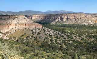
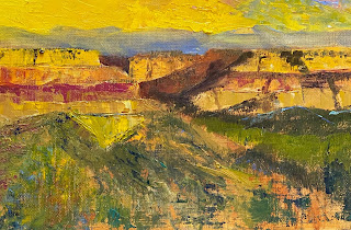
One scene I would love to paint are the cliffs seen from the Anderson Overlook, the dramatic scene that all travelers see on their way into the Los Alamos area. It's beautiful, but difficult to paint. Here is my first (studio) attempt with a photo of the scene:
I had trouble with the painting, but I began on a bad foot: I decided to use a piece of oil-primed linen taped to a board. This doesn't work with my water-based oils. So, I've learned a lesson and will only use the acrylic primed linen boards that I like the most: Raymar's 22U (universal) linen on board.
But what else don't I like about the painting and why and/or what changes would I make?
- the yellow section of the sky seems out of place (I should just make the whole sky blue with perhaps letting it 'fade' to light cerulean as it nears the horizon.
- the shadow part of the hills are too dull (not sure what I would do here).
- the orange of the cliffs should be more muted, slightly pinker
But I am not going to spend the time to change this study.
But perhaps the problem is that the painting doesn't emphasize the grandeur of the scene. So I looked for other photos such as the following, which places the cliffs farther away.
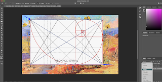
I wanted to make this a 10x16 proportioned photo since I am trying to do 'golden mean' paintings. I also wanted to make sure that a focal point would be at the intersection of a main diagonal and a crossing line, also called a reciprocal: the crossing line would be perpendicular to the main diagonal. There is much literature on how this is a good focal point, perhaps better than just an intersection at thirds:
the reciprocal -or crossing line- is active and thrusts the viewer's eye to the focal point dramatically.
In addition this intersection turns out to be the 'eye' of the Fibonacci Spiral when applied to a rectangle of golden mean proportions. Then we can use the spiral to draw the viewer's eye to the focal point.
Moreover we could use a dynamic symmetry grid, which though symmetric, will provide the artists with many points of interest, or line segments that will lead the eye to this main focal point.
So which focal point will I choose? It could be one of four such intersections of the diagonals and reciprocals.
In any case I chose the upper left and then modified the image in Preview, cropping it in such a way that the 9x12 photo became a 10x16 photo, making sure that the resulting diagonal lies along the main front cliff line as it heads down toward the bottom right:
This eliminated too much of the foreground bushes which I want to include to help with the aerial perspective of the painting. But, as an artist I don't have to copy the photograph. I will add those bushes/grasses to the foreground of the painting.
I also like the v-shape of the main cliff that is at the left edge of this photograph. So I will adjust the painting so that the right-side of this "V" lines up with the crossing line.
 Photo Reference with Dynamic Symmetry
 Photo Reference with Fibonacci Spiral
So time to paint:
1. 4x6 card sketch/value study and b/w gray-scale photo.
I had decided to make the back cliff lower than the front, but now that I look at the sketch, perhaps this is a mistake. I wanted the main focal point to appear closer, but part of the drama of these cliffs is that they do seem to align so perfectly. And the hill tops are at my eye level from across the canyon.
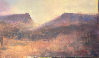
And the final painting, Turbulent Lands I, painted during the Paint Out but while in my hotel room.
Turbulent Lands I, Studio painting, 10x16, oil
I ran out the next dawn with my setup to paint the scene toward the west 'en plein air' but got distracted by the beautiful dawn in the other direction:
Eastern Dawn at the Los Alamos Overlook, "en plein air", 10x16, oil

Dawn - Los Alamos, "en plein air", 10x16, oil with updates in studio
I basically intended to use Dynamic Symmetry grids to design my paintings at the Paint Out. And I wanted to use my Golden Rectangle panels (10x16 - or 5x8). They are not perfect golden rectangles; a 10x16.18 would be better to within a hundredth.
And I analyzed the cliffs from photos in advance. However, I found it difficult to paint from the side of the road facing the cliffs. The traffic was noisy and disconcerting, So I decided to do a studio painting at the motel and then start again the next morning at the site, trying to ignore the noise and traffic. It turns out that I was met by a glorious sunrise that took my mind away from this particular view the next morning and ended up not doing a plein air version (yet).
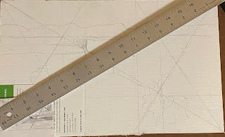
As indicated at the beginning of this post, I began with one vista and then with the help of a study and the grids decided on another vista. So I did a thumbnail and then a grid and a sketch on my 10x16. Note the light sketch of a spiral in the thumbnail 'ending' in the upper left:, a potential focal point area:
thumbnail about 2 x 3.5, proportions close to the 10x16
In fact I lined up the diagonals so that you can see that these are the same proportion (I also was looking at a card that seemed to be in the same proportion):
 Lining up the the thumbnail with the Fusion panel
Grid and sketch on Fusion panel before painting
It's a little hard to see this grid and sketch. Unfortunately I did not take intermediate photos.
But I do wonder if spending the time planning the design made this a better painting.
Turbulent Lands I with a Dynamic Symmetry Overlay
 Turbulent Lands I with a Fibonacci Spiral Overlay
