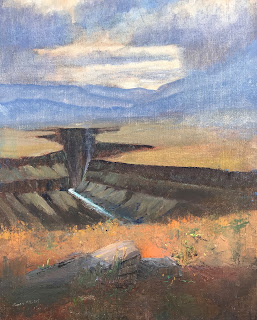
Analysis of Taos Gorge Fusion
I did not use a Dynamic Symmetry Armature during the design of this painting. I decided to analyze the design against an armature to see how the painting could be improved - or not.
First I layered a Dynamic Symmetry Armature plus Rebated Squares on the painting as is:
However, I can see several points to make: if the brightness of the sky is to be a focal point, it's not close to our usual focal points: the intersections of diagonals and their reciprocals. In fact, though, perhaps a better focal point would be within the gorge itself. I do see an alignment of edges of the canyon with the armature. Also note the parallel of the river with a reciprocal line.
But I decided to analyze further by looking at the armature in photoshop, layering it over the image and then moving it around:
On the other hand, now that I analyze the painting further against the original armature, I am not unhappy with it; it almost looks as if an armature were in fact utilized during the painting.
Here's a cropped version:
Cropped Taos Gorge Fusion
The sky has been reduced.
Let's put these images side-by-side for comparison:
So, the question is: Should we:
- Leave the painting alone?
- Crop the panel to the indicated smaller size?
- Start over again with a new painting?
What do you think?


 .
. 


