Chromatic Lands I Analysis
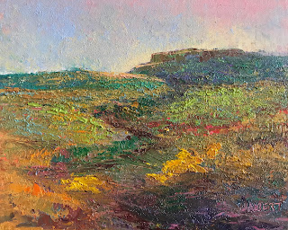
Chromatic Lands I is a favorite painting due to its range of colors and its textures. I will probably try to reproduce this painting in different formats or larger. In this case, I feel that the top hill is too centered. I do like the way that the darker ‘path’ is an s-shape leading to this cliff in the distance. So, I intend to move the cliff to the right. I used photoshop to do this and to experiment with a 'golden rectangle'.
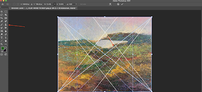
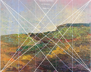
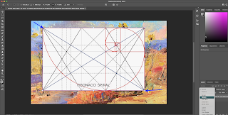
First, I opened this image in photoshop and layered a PHI grid on top, moving it around until the top cliff fell at the golden 'point':
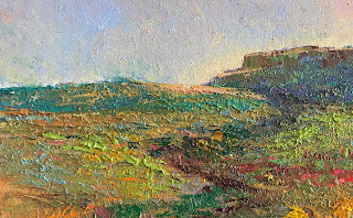
I then cropped the jpeg image with and without the armature:
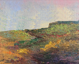
But starting again with the 5:4 version, I decided to use Photo Shop's clone tool to move the cliff down and to the right so that it would be at the intersection of the 'baroque' diagonal and its right-hand reciprocal.
I continued to this point:
Is this better than the original with the cliff to the right and down a little? The sky seems to be around 33% of the whole, which is reasonable.
But perhaps a PHI shape would be good after all, a 'Golden Rectangle'.
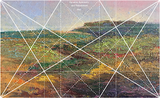
An easy experiment would be to change the proportion and then apply the PHI Armature in the simpler Preview app. Then the dimensions would be more like 8x13 or 6 to 10 than 8x10.
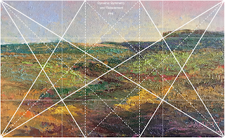
I like keeping the whole foreground here but feel the top cliff should be moved to the right while using this Golden proportion. So back to the Photo Shop Clone tool for this PHI version:
I wish I had a large printer; then I could print an 8x13 and frame it. Well I could try a 6x10, but I don't have a 6x10 frame,
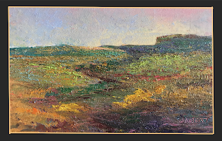
Here's a photoshopped PHI version with a made-up black with gold frame. (I wish the frame shop had a tool that we could use to experiment with frames).
