Turbulence Series: Aspens and Color Analysis
Turbulence Series: Aspens
Introduction
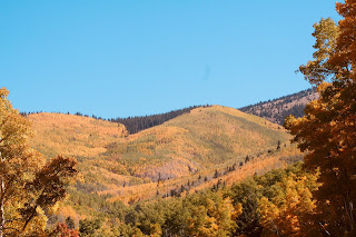
I intend to do several 8x10 paintings of this photo, taken up in the Aspens near the Santa Fe Ski Area in the Sangre de Cristo Mountains (circa 2013).
References:
Aspen Turbulence #1. Prismatic Full Palette with Brush only
Aspen Turbulence #1 (using full prism of colors with brush only)
First attempt at painting the aspen scene using the full palette of colors and brush only. I considered this a failure so I wanted to analyze how I could improve it. For this reason I created this post. This painting had too much green in it so I wiped out the lower left green area. zit had a large tress (the ghost is still visible) so that the other problem with this painting was the 'goal-posting' considered a no-no. I also reaslized that I didn't need to use the full range of colors so for the later attempt I will use a limited palette. Note that some FB friends preferred this painting.
Full palette: cadmium lemon, cad yellow medium, cad yellow deep, cad orange, vermillion, cad red light, pyrrole red, madder lake, permanent rose, permanent magenta, ultramarine blue, cobalt blue, cerulean (phthalo) blue, green deep (phthalo blue and phthalo green), transparent red oxide, yellow ochre.
Limited Palette
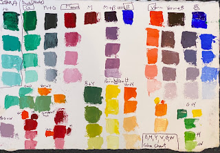
I decided on the following limited palette after testing various combinations, but trying to arrive at a cool and warm of each of the primaries.
Here is the test chart (on Arches Oil Paper):
Note all colors are Cobra Water-based Oil.
I tested the pure phthalo green versus the Deep Green, which is this phthalo green plus permanent yellow light. I considered not using a green but decided to use it as a replacement for a cooler blue (cerulean).. The mixture with white will be good in skies. I also decided that the cadmiums might not be necessary; in fact they might be contributing to a garish color. So I decided to use a permanent light yellow as my main yellow. I also decided that it could serve as the cool (with white) and warm (with a touch of a red) yellow.
For the red, I've liked the Vermilion in the past, a rather dark orange (pigment PO43), to be used instead of the cadmium orange or even the cad red light. This will be my warm 'red'.
The Madder Lake is a substitute for Alizarin Crimson. It does not make a brilliant purple (nor does the Vermilion, as you can see in the charts. But for landscape paintings (which Ido), I think these 'purples' will serve. If I want to do a sunset painting I might reconsider. The palette mixtures of blue and the others here will be appropriate for the skies.
My usual palette has yellow ochre and transparent red oxide or burnt sienna, excellent convenience colors in New Mexico. These can be mixed from the primaries and I wanted to see how far i could push a limited palette.
Colors
So my palette for these exercises will be:
White, Permanent yellow light (PY154), Vermilion (PO43), Madder Lake (PR254), Ultramarine Blue (PB29) and Deep Green (PG7 and PY154) (all Cobra Water-based Paints). On the edge of the palette I included mixes of the basic 5 paints to yield finally: yellow, yellow/vermilion, vermilion, vermilion/madder, madder, madder/ultramarine, ultramarine and deep green (adding a madder/green also to create a dark). You can also see mixes with white just below each pigmant pile.
Note that Cobra's pure Phthalo Green is the single pigment PG7. So I could use the phthalo green rather then Green deep and mix it with the Permanent Yellow Light. However the Phthalo Green does not come in a large (more economic) tube. The Permanent Yellow Light comes in a large tube, however, so ultimately I might choose to get the smaller phthalo green tube and use the larger perm yellow light tube. But the chart indicates that the light version of the perm green is good as is for the skies,
Transparency: from my watercolor days my leaning is toward transparent colors versus opaque colors. But any transparent color can be made semi-opaque with white and any opaque color made more transparent with water or medium, or in this case with Cobra Paste, which is a colorless paint that can be added to any cobra paint. This paste is used especially when painting thickly with a palette knife. It's also a good way to extend the paints. In addition, it makes the paint more transparent. The Madder and Ultramarine on the palette are both transparent.
Some artists feel that the Madder Lake is the best replacement for Alizarin Crimson for our landscapes, as is the permanent green a good replacement for the popular Viridian. I like Cobra's Carmine but it's a little to 'pink' for landscapes I feel and it doesn't come in a larger size- and it's more fugitive apparently.
Vermilion
I have not seen anyone else use the Vermilion on the basic palette. A little more on Vermilion: the original Vermilion is considered toxic and fugitive. It was originally made from powdered mineral cinnabar. Cadmium red is considered a replacement for this popular historic color. The original Vermilion pigment classification is PR106.
From http://www.webexhibits.org/pigments/indiv/overview/vermilion.html: " An orangish red pigment with excellent hiding power and good permanence. It's a mercury sulfide mineral (cinnabar) used from antiquity through to the present though only scarcely due to its toxicity. Made artificially from the 8th century (vermilion), it was the principle red in painting until the manufacture of its synthetic equivalent, cadmium red."
Winsor & Newton states: "The brilliant and distinctive red of vermilion has been used extensively across thousands of years of art history, from the art and decoration of ancient China and Rome through to the manuscripts of the middle ages and the paintings of the Renaissance." (from https://www.winsornewton.com/na/articles/colours/spotlight-on-vermilion/ - a fascinating account). In Taoist culture, it is regarded as the colour of life and eternity.
It is almost impossible to find this in paint tubes now. Holbein does advertise a very expensive PR106 (genuine) Vermilion on Dick Blick (currently $34 for a very small 20 oz tube at 31% off).,highly toxic if inhaled.
The pigment (PO43 -Perinone Orange) used for Cobra's vermilion is semi-opaque. Note that the PO43 is also used in Cobra's Permanent Yellow Deep and Pyrrole Red Light.
I took this opportunity to re-read my tome, A Red Like No Other, purchased at the Folk Art Center of Santa Fe on Museum Hill a few years ago based on an exhibit of the same name. It concentrated on the use of red created from the cochineal beetle but it has extensive references to cinnabar (vermilion) also. I will report on this later.
Aspen Turbulence #2. Limited Palette on Blue/Orange-toned Panel.
I toned several 8x10 linen panels using complementary color schemes: Blue/orange, Violet/yellow, Red/Green and an additional one: Burnt Sienna/Yellow Ochre.
The first one used the blue/orange scheme:
Blue/Orange-toned Panel
Aspens Turbulence #2 (on Blue/Orange-toned panel)
Created with thick paint over the thinly toned panel using a palette knife. My first version, which I allowed to sit overnight, had a sky that was too"wild". I felt that it should 'match' the technique used in the rest of the painting but it instead was too jarring. So I smoothed out the sky. The right-hand tree was too regular also so I modified it carefully.
I didn't want to make too many modifications since it was important to me to try to get the strokes down once without going over them (or without scraping off and trying again). I did decide to glaze with a little "red" to some areas that were too light yellow however.
Here is yesterday's first version of this painting.
Aspens Turbulence #2-Ver 1 (before changes to sky and tree plus..)
Aspen Turbulence #3. Limited Palette on Yellow/Purple-toned Panel.
For my second limited palette/knife version I will use the toned palette, yellow/purple especially since I feel that shadows are best represented as the transparent purple.
Aspen Turbulence #3 (on purple/yellow toned panel)
This time I think the 'wilder' sky worked.
Purple/Yellow Toned Panel
I might try some without the foreground trees.
Two days later: another version. I studied my Aspen photos and decided to start over with a different toning scheme. I used Indian Yellow (Cobra) since I felt that it best represented the feeling of the Aspens. I also decided to use brush only rather than palette knife. I kept the sky yellowish since I liked it that way.
First Pass Aspens with Indian Yellow Toned Panel
with the photograph:
In fact in the end the Indian Yellow might be too garish or orange. But the main problem with the painting, I believe, is that it is overworked. When I work with a brush I tend to repaint again and again. This is one of the reasons I have been using a palette knife.
I also removed the larger tree (for the purpose of this exercise).
Critique:
The shadows in the mountains are too 'red'. I used the purple formed by mixing the madder and ultramarine blue (and a little white).
Before continuing with another post on palette knife versus brush work I would like to leave this post with a different painting I did last year in Arizona, a painting that I will use as a model for the brushwork technique:
Elephant's Head, Arizona. 11x14, oil
One last Aspen Version:
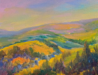
Painted to highlight brushwork. Full palette, in particular Cadmium Yellow (medium) rather than Indian Yellow.
Aspen Hillside
Cobra Full Palette: cadmium yellow medium, cadmium orange, cadmium red light, permanent rose, madder lake, ultramarine blue, cobalt blue, cerulean phthalo, sap green, deep green, burnt sienna (W&N), yellow ochre
Notice that I replaced the Vermillion with a mixture of the cadmium orange and cad red light. This mixture might better approximate the darker (redder) cadmium orange from Utrecht that I have on my pure oil palette.
I left mixtures of the sky colors on the palette and created some dark colors as well: mixtures of madder, ultramarine and the deep green, with a little area with some orange and burnt sienna.
In the end I might not title these paintings "Turbulence". There's a peaceful quality to the Aspens in the Sangres that is not represented by this term. "Turbulence" refers to how nature creates the mountains, hillsides and aspen groves. Of interest might be the description of how the aspen roots form. In the ground aspens pop up out of roots from other aspens, creating a network of roots. Can we describe this network as 'turbulent' or perhaps chaotic. In either case the mathematical principles underlying chaos leads to a beauty which can only be explained by Mathematics and patterns. Fortunately Mandelbrot developed this explanation in the 80s - how we see beautiful patterns within chaos and how chaos theory can explain beauty.
Aspen Root System (link)
This link indicates a term I have not known before: "Quaking". Perhaps we can call these paintings "Quaking".
From the Santa Fe New Mexican (2015) - Santa Fe in Bloom article by Carole Langrall: "While the trees can last more than 150 years, their super-immune root system can stay dormant and alive for thousands of years, which will eventually sprout genetically identical trees, called “clones,” if the growing conditions are ripe. They are called clones as they each have identical characteristics from sharing the same a root structure."
Fibonacci Series and Tree Growth
I came across an interesting link while googling for aspen root system + golden spiral using my favorite sequence: Fibonacci:
https://www.amnh.org/learn-teach/curriculum-collections/young-naturalist-awards/winning-essays/2011/the-secret-of-the-fibonacci-sequence-in-trees
"I began to see how nature beat this problem. Collecting sunlight is key to the survival of a tree. Leaves are the solar panels of trees, collecting sunlight for photosynthesis. Collecting the most sunlight is the difference between life and death. Trees in a forest are competing with other trees and plants for sunlight, and even each branch and leaf on a tree are competing with each other for sunlight. Evolution chose the Fibonacci pattern to help trees track the Sun moving in the sky and to collect the most sunlight even in the thickest forest.
I saw patterns that showed that the tree design avoided the problem of shade from other objects. Electricity dropped in the flat-panel array when shade fell on it. But the tree design kept making electricity under the same conditions. The Fibonacci pattern allowed some solar panels to collect sunlight even if others were in shade. Plus I observed that the Fibonacci pattern helped the branches and leaves on a tree to avoid shading each other.
My conclusions suggest that the Fibonacci pattern in trees makes an evolutionary difference. This is probably why the Fibonacci pattern is found in deciduous trees living in higher latitudes. The Fibonacci pattern gives plants like the oak tree a competitive edge while collecting sunlight when the Sun moves through the sky."


