Harmonic Armature
As I dig deeper into the Dynamic Symmetry Armature I am drawn toward a simpler armature: Harmonic Armature. I studied it early on and liked it but the more mathematical nature of the Dynamic Symmetry grid appealed to me. But for the purposes of demonstrating how one can use an armature to help in one's composition, I appreciate how most non-mathematician artists would prefer to keep it simple, while still adhering to mathematical principles found in the design of nature and art. The complication for the Dynamic Symmetry Armatures is that each one is different depending on the aspect ratio; the reciprocals must be perpendicular to the main diagonals. In the Harmonic Armature the angles between the lines or diagonals are different for each panel proportion, but in fact the divisions are the same (which we will show); four of the intersections are always at the third marks, for example, popular in the Rule of Thirds.
My plan is to evaluate good art using the harmonic armature. In addition, I will construct the harmonic armature for my favorite paintings and see if these will yield good results.We are fortunate to have several well-known artists using the harmonic armature such as Thomas Kegler.
Kegler has provided an excellent introductory public pdf describing how he uses a harmonic armature: https://thomaskegler.com/public/documents/resources/process/compostion-tips.pdf. "The major intersections correlate to the musical harmonic scale (one third, one quarter, one half, two thirds and three quarters )." This statement underlies the rationale behind the name of this armature. Another important aspect of the harmonic armature is that it is an extension of the rule of thirds (ROT). Some artists have stated that the rule of thirds is too simple an armature. But we will show how the harmonic armature and its extensions will keep us from relying upon the simplistic, "boring" ROT.
I intend to look at some of the mathematics and geometry behind the harmonic armature.
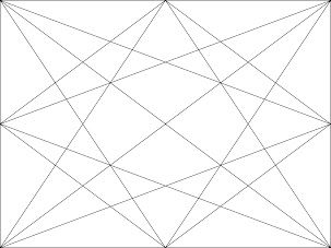
But before going too much further, here's a diagram of a harmonic armature grid. Note that the number of lines for this basic grid is 14. We might call these 14 lines 'diagonals' (as opposed to horizontals and verticals). We do see two main diagonals extending from corner to corner. The baroque diagonal extends from the lower left to the upper right while the sinister diagonal extends downward from the upper left down to the lower right.
Other 'diagonals' are constructed by drawing lines from the edge midpoints to the corners or to other edge midpoints. It can be shown that the distances between the intersections and the edges are at exact fractions; eg, the 'stars' above are 1/3 distance from the edges. The intersection points in the middle of the panel are clearly 1/2 the distance from the edges (or 1/4). This is of interest since rational numbers were magical to the greeks; in fact until the discovery of PI and Root 2, only rational numbers were considered to be actual numbers. The concept of non-rational and imaginary numbers meant nothing. Lo and behold, using geometric constructions Pythagoras' followers were able to show that something which we can call Root 2 has a numerical, measurable meaning; it can be constructed and measured. But the discovery lead to a new result: there are numbers that are not 'rational'; eg, the ratio of two integers. Root 2 is not rational but is easily constructed and measurable with a ruler. A popular problem is to prove that the square root of 2 is not rational (by contradiction: assume it is and manipulate the equation to get a contradiction). In the meantime, the fact that the intersections in this Harmonic Armature lie at rational intervals was pleasing to Greek Artists. This was especially true since they saw parallels with musical notes and their ratios.
At the very beginning of Kegler's article he drops verticals and horizontals through points of intersection, creating a finer grid. He along with others suggest that the beginner actually start with just three lines: a vertical, a horizontal and a diagonal. Determine where they should be in your painting after analyzing the scene you are painting. Michele Byrne uses the term dominant for these three lines. This is the first step in her painting. She will make a thumbnail sketch using a dominant diagonal, horizontal and vertical. I have begun to use this method also, perhaps at first not fixing on the panel proportion to use yet. The thumbnail will help me decide which proportion to use. However, by the second sketch at least, I will draw the thumbnail in a rectangle the same proportion as my painting panel.
The panel proportion is an important part of the painting process. Please have a look at the various posts I have written on panel proportions. But in general, we use the popular sizes; later I will continue to explore sizes that fit in with the dynamic symmetry schemes such as Root Rectangles; eg, 1: 1.723, a Root 3 aspect ratio. The popular sizes for plein air work are square (1.00), 8x10 (1.25), 11x14 (1.2727..) and 9x12 (1.33.. ). - and a 1:2 horizontal proportion; eg, 8x16 (2.00). The aspect ratios between 1.33 and 2.00 seem not to be as popular. Perhaps we should look for a panel size that might meet the need for a landscape, say, that is between these two proportions. I like to use 10x16, (1.6 close to the golden mean, 1.618..., an irrational number). But other possibilities are 8x12, a 3/2 ratio or 1.5.
We note in passing that the camera proportions readily available for shooting a photo include square, a 4:3 ratio and a 'new' 16:9 video, wide-screen proportion. The 16:9 aspect ratio doesn't translate exactly to any popular panel, so perhaps a 9x16 panel would be in order with its aspect ratio of 1.777... I've read the theory that this is a new modern shape since our tv's are in this aspect ratio, which means that we are becoming very familiar with it. This means that it will be pleasing to our eye since it is a familiar ratio. The 10x16 proportion I have been using is close to this.
So, we discover panel sizes between 9x12 (1.33..) and 8x16 (2.0), that are not readily available but could be useful for landscapes with aspect ratios, 1.5, 1.6 and 1.777.... ; eg, 8x12, 10x16 and 9x16
So, back to the harmonic armature. If you have a harmonic armature and wish to sketch a scene on top of it, you may use the diagonal angles as leading lines and points of intersection as focal points. Kegler states, "Elements are not simply subjectively arranged because they feel “right” – they are objectively arranged to be visually pleasing." He provides examples of several sketches in his article linked above.


.png)


