Water-Soluble Oils: Modern Primary Mixing
I wanted to see if the Modern Primary palette could be sufficient for a trip to Hawaii. These include the Cobra Water Based Colors: Primary Magenta, Primary Cyan and Primary Yellow and Ivory Black (and Titanium White). This was another time-consuming chart The time could have been shortened by doing only half of the chart or by changing the colors on one of the axes to a tint, tone or shade (or all three!). Perhaps one axis could be just the three primaries, similar to the color wheel for its mixing. We still want to try the tints, tones and shades as well. I think the Ivory Black column should be a glaze of black over the color. This might give a better result.
Tips (that I did not follow here): a touch of white in the darker colors when mixing would have a more chromatic result and be a better indicator of the mix. A more inclusive full chart might also use the left axis column for dominant hues; the row's result would have more of the color on this column than the row at the top (this is the way the Magic Palette is constructed). So, for example the color patches for the Primary Cyan mixed with Primary Magenta would look different depending on whether we've chosen the Primary Cyan from the left (column) or from the top row.
For the chart I did here, if you divide it on the diagonal from the upper left to the upper right, you would have mirror images (except for the added 'greys' on the right); the color in the x row y column is the same as the y row and x column. This is redundant and we could do a more compact and expressive chart before tackling the color wheel.
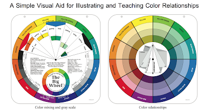
Cobra Mixing Colours' Brochure
Let's consider the color wheel.

Side 1. circle of 12 hues. Under each hue we have six patches: tints (+white), tones (+gray) and shades (+black), for a total of 72 color patches.

Side 2. circle of 12 hues. Under each hue we have mixes with each of the three primaries, as well as with white and black. In our chart these would be in rows, but for the circle, to match the 'holes' in the overleaf we arrange the mixes differently so that as we rotate the circle the right mix shows. But bottom line, we could do the same by making a rectangular grid: twelve color/hues at the top, with rows of mixes with 'red', 'blue' and 'yellow' as well as rows with mixes of white and black for a total of 60 color patches.
Are some of the color patches on side one duplicates of side two? How much redundancy is there? The color patches under each of the primaries on side two would be duplicated on side one (e.g., red x red). Also each of the mixes of primary 1 with a primary 2 is duplicated. So we can eliminate some of the patches for our rectangular grid chart.
Rather than dive right into the blank color wheel with all these color patches, I will do a few limited charts to see if 3 colors + W + Bk suffice for my needs.
So, I will add the white column mix to the original chart above, as well as a grey, which for us here is the black plus white. In reality I would want mixes of primary+white with the 12 hues as well as primary + black with the 12 hues. This is not part of the color wheel.
Tips (that I did not follow here): a touch of white in the darker colors when mixing would have a more chromatic result and be a better indicator of the mix. A more inclusive full chart might also use the left axis column for dominant hues; the row's result would have more of the color on this column than the row at the top (this is the way the Magic Palette is constructed). So, for example the color patches for the Primary Cyan mixed with Primary Magenta would look different depending on whether we've chosen the Primary Cyan from the left (column) or from the top row.
For the chart I did here, if you divide it on the diagonal from the upper left to the upper right, you would have mirror images (except for the added 'greys' on the right); the color in the x row y column is the same as the y row and x column. This is redundant and we could do a more compact and expressive chart before tackling the color wheel.
 |
| Modern Primary Triad Water based oil Mixing Chart |
Cobra Mixing Colours' Brochure
 |
| From a Cobra brochure |
Let's consider the color wheel.

Side 1. circle of 12 hues. Under each hue we have six patches: tints (+white), tones (+gray) and shades (+black), for a total of 72 color patches.

Side 2. circle of 12 hues. Under each hue we have mixes with each of the three primaries, as well as with white and black. In our chart these would be in rows, but for the circle, to match the 'holes' in the overleaf we arrange the mixes differently so that as we rotate the circle the right mix shows. But bottom line, we could do the same by making a rectangular grid: twelve color/hues at the top, with rows of mixes with 'red', 'blue' and 'yellow' as well as rows with mixes of white and black for a total of 60 color patches.
Are some of the color patches on side one duplicates of side two? How much redundancy is there? The color patches under each of the primaries on side two would be duplicated on side one (e.g., red x red). Also each of the mixes of primary 1 with a primary 2 is duplicated. So we can eliminate some of the patches for our rectangular grid chart.
Rather than dive right into the blank color wheel with all these color patches, I will do a few limited charts to see if 3 colors + W + Bk suffice for my needs.
So, I will add the white column mix to the original chart above, as well as a grey, which for us here is the black plus white. In reality I would want mixes of primary+white with the 12 hues as well as primary + black with the 12 hues. This is not part of the color wheel.


