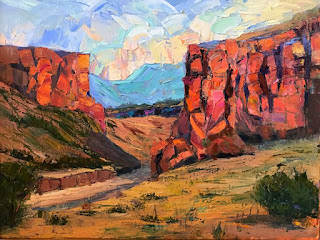
Canyon Colores
The canyons of Ghost Ranch and Chama River are an hour’s drive from my Santa Fe home and I try to go there to paint as often as possible. This was the home of Georgia O’Keeffe. Sometimes I try to channel her style but more often I tend to want to use more color and also to use a Palette Knife (or knives). I like the feel of working with a knife and you can judge for yourself but the results are often better for me.
So, I have done a series of canyon color paintings recently primarily using palette knife.
This is of the first large ones (18x24). I actually took some liberty with a nearby ‘canyon’, Diablo Canyon, just up the road from me. Its rock formation consists of tones of grey rather than the colors of the Ghost Ranch area. But I enhanced the color to reflect the early light of dawn to arrive at this:
Diablo Canyon, Morning Glow, 18x24, oil.
This sold at the Marigold Arts Gallery in Santa Fe.
I then continued with he theme, but this time in my chosen venue of Chama River/Ghost Ranch to paint:
Chama Colores, 12x16, oil.
I reserved this for the annual Las Campanas Charity Auction held at the end of June 2019. I actually painted this as a “concept” painting, having been introduced to the idea by fine artist, Roger Williams. I chose a few words/terms and constructed a painting base on these: canyon, afternoon light, cliffs, color.
I tried a larger version of this:
Colores, 18x24, oil.
Then this past week, I felt inspired after a painting trip to Abiquiu, and did a small painting with a title Piedra Lumbre I, followed by a larger version, of the cliffs just outside Ghost Ranch:
Piedra Lumbre I, 7x11, oil.
and
Piedra Lumbre II, 15x24, oil
Piedra Lumbre means Shining Stone.
The Piedra Lumbre paintings have a proportion that is approximately the golden mean, an irrational number, described more fully in other articles on this blog. I’ve done many paintings, with 10x16 dimension and a fe 15x24, and this 15x24 is 50% larger in each direction, still with a ratio of 10/16 or 5/8. Note that these are two number in the Fibonacci sequence. 1,1,2,3,5,8, .... And as described elsewhere, the radio of two consecutive numbers gets closer and closer to the golden mean as we progress through the sequence. I think the number is something like 1.610287.... but I will have to look it up. The ... means continues without end (and cannot be expressed as as a ratio of two whole numbers). Try calculating:
5/3, 8/5/ 13/8, 21/13,...
A different series, but still a Fibonacci series, might begin with: 1, 3, 4, 7, 11 which actually behaves in a similar fashion.
The golden mean is related tot he golden spiral, a form found in nature everywhere since it in fact represents how growth takes form (think sunflowers, ferns, tree branches, Nautilus Shell). The ratio is thought to be the most pleasing to the eye, perhaps because it is to pervasive and perhaps because it is natural.
But I digress. I love doing these paintings that I consider somewhat abstract. This allows me to use shapes and colors that appeal to me.
In reality I like the smaller Piedra better and will now analyze why, perhaps touching up the larger version so that it glows in the same way.
By the way, the scene that inspired the Piedra Lumbre pair is this:
Piedra Lumbre Photo
And two more photos:
Piedra Lumbre II palette
Piedra Lumbre II Shadows
The colors mixed on the palette are the ‘grey’ for the shadows (a mix of the Ultramarine Blue and the Vermillion plus white). The remaining colors above the palette I then proceed to mix for variations on the cliffs.
The full palette: (Cobra unless otherwise stated). Titanium White, Cadmium Yellow Medium, Cadmium Yellow Deep, Vermillion, Madder Lake (alizarin crimson substitute), Ultramarine Blue, Cerulean Blue Hue (really phthalo blue and white), Viridian (W&N Artisas WB Oil), Sap Green, Burnt Sienna and Yellow Ochre. In front of each pigment I missed a mid-tone of the pigment and white. For these paintings I used very little of the greens.
And finally a photo of the two piedras side by side for size comparison:


