A Tale of an Award Winning Painting - "Santa Fe River Turbulence"

Award presented at the opening show for the 2016 Plein Air Artists of Colorado Annual Show at the Mary Williams Gallery in Boulder, Colorado.

Santa Fe River Turbulence, 10x16, oil
(Santa Fe River Turbulence now hangs in my son's home, chosen by the family as their favorite of my paintings at that time.)

"Santa Fe River Flows I", oil, 6x12" (sold)

"Santa Fe River Flows II", oil, 6x12"
{
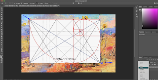
As I was painting, I was conscious of utilizing a "golden spiral" with a focal point at the golden mean. Fortunately I had chosen a golden ratio for the panel: 10 x 16 (or as close as I could get to this irrational number). I noticed that the rocks formed a kind of spiral, spiraling to that point and I took advantage of that.
Close-up photo of a section of the river:
 |
| Santa Fe River |
After painting in the darks with ultramarine blue and Van Dyke Brown (cool and warm) to enforce the pattern and depth I began to place the colors I saw in the water - variations of the primaries, cool and warm with the use of special colors for neutralizing or accenting the painting. The colors used were: Alizarin Crimson, Cadmium Red Light, Cadmium Yellow Light,
Ultramarine Blue and Cerulean Blue Hue and Titanium white of course from different manufacturers (primarily W&N, Utrecht, Gamblin . I probably added some secondaries: Viridian Green and SapGreen, Cadmium orange and Cobalt Violet as well as Cobalt Blue. Neutral and accent colors included Gamblin Warm White, Holbein Rose Grey, Gamblin's Portland Grey Dark and Grumbacher's Thalo Yellow Green.
Of note is that I have become freer with the palette knife; if you inspect the small first paintings you can see the knife strokes. In my efforts to paint solvent-free I find that this helps - fewer brushes to clean but also with resulting cleaner colors. Later in this story for other paintings, my palette changed somewhat for additional river paintings.
Early Stage:

Finishing up:

At this point I added a few sparkles in the river and the trees and some blue sky holes. And ended up with this:

"Santa Fe River Turbulence", 10x16, oil.
About this time I was invited into the Marigold Arts Gallery on Canyon Road. They were looking for larger paintings so that I used the Santa Fe River Turbulence to create larger paintings that became part of my "Return to the River Series" at the Marigold gallery.
Note that I changed my palette in the meantime, using primarily Williamsburg oil paints (for the warm and the cool of each primary) along with the transparents and accents mentioned above.
So, a few small paintings can lead to others, larger and presumably better. "Practice makes perfect" it is said. See additional river paintings at the Purple Sage Gallery (www.purplesagegallery.biz) and the Marigold Arts.
Final note: Happenstance further inspired me in the river paintings. During a large Hillary Clinton fund-raiser, hosted by my son, Josh Ginsburg, and other family members, Josh met and became friendly with Vikas Khanna, renowned author, spiritualist, representative of India and celebratory Indian Cuisine chef. I needed to learn more about him since I do not watch cooking shows on TV so Vikas graciously sent me two books as the mother of his new good friend; one was "Return to the Rivers" about his pilgrimage in India. This inspiring book resonated with me and, with his permission, I titled my show at the Marigold: "Return to the Rivers". Vikas continues to inspire his countrymen and our leaders with his voluntary work for mothers and children in shelters and has millions of followers on Facebook.
Karen L. Halbert
Addendum:
Information about Holbein's Rose Grey, from the Dick Blick Art Supply site.
Since I often use the Transparent Oxide Red as a toner, I find that rose grey is harmonious when I wish to tone down the painting in bright areas or to brighten up the painting in duller areas.00425-3174 — Rose Gray
This color contains the following pigments:
PR101—Red Iron Oxide
Pigment Type
earth, synthetic
Chemical Name
iron oxides (synthetic), iron oxide, silica, alumina, lime, and magnesia or hydrated iron oxide
Chemical Formula
Fe2O2 or Fe2O3 • H2O
Properties
Red iron oxide varies in hue and transparency, depending on hydration and slight impurities. Indian Red is a slightly duller, deep brick hue with a bluish undertone. It is very dense and opaque, with excellent tinting strength and covering power. It is dependable when mixing with all other permanent pigments and yields good flesh tints when mixed with Zinc White. It is the synthetic version of PR102, which is a pigment made from earth reds, or natural red iron oxides, and the names applied to PR101 and PR102 often overlap. The synthetic red iron oxides have mostly replaced natural red iron oxides and are brighter, stronger, finer, and more permanent. Indian Red is the highest grade bluish shade. Light Red, English Red, and Venetian Red are yellowish shades. Mars Violet is a dull and subdued bluish or purplish oxide.
Permanence
Red iron oxide is very lightfast with excellent permanence.
Toxicity
Red iron oxide has no significant hazards.
History
Natural red iron oxide comes from the mineral ore hematite, called bloodstone by the ancient Greeks from the word hema, meaning blood. It is one of the oldest pigments, has been used by every major civilization, and was an important mineral for medieval alchemists. It was not widely used in artists' materials until the 17th century and was not produced in large quantities until the 18th century.
Alternate Names
Indian Red, Colcothar, English Red, Light Red, Mars Red, Mars Violet, Morelle Salt, Pompeian Red, Indian Red, Red Oxide, Sinopia, Spanish Red, Terra Rosa, Tuscan Red, Venetian Red, Venice Red.